Your website should tell your firm’s unique story.
Here’s Part 2, litigation firms 6-10. Below we describe the rebrand of tough, dynamic, trial-oriented firms that might outwardly seem quite similar. (Read Part 1 here.)
But each was much more than that. Each firm was different and unique in a meaningful way, and its brand needed to capture and convey that message and tone quickly, effectively, and memorably.
Consider, does your firm’s brand do that? It can. It should. Contact Ross if you ever want to discuss it at ross@fishmanmarketing.com. (And click here to watch our powerful strategy and branding video.)
6. Weltman collection lawyers.
Debt collection is a vital part of the economy, ensuring that commerce flows freely and efficiently. Weltman Weinberg & Reis is the nation’s largest debt-collection firm, combining both a law firm and collection agency, with 700 skilled lawyers and professionals under one roof. We were asked to brand both sides of the business to help market to sophisticated companies and financial institutions from seven offices nationwide.
Our research disclosed the firm’s many unique differentiators. There were so many, in fact, that we highlighted each of them separately under an “arrows”-based design umbrella. Our new tagline spoke to the strategic big picture, its one-stop-shopping benefit it offered to clients: “The single solution for every single creditor.”
Logo before and after:
![]()
Four of the six design directions, picking up the new logo’s arrow:
![]()
7. Low Ball & Lynch
Low Ball and Lynch was a small, high-quality, San Francisco-based insurance defense firm, nice people with a comically bad name. In fact, they were often mistaken as a fake firm (like Dewey Cheatham & Howe) on late-night television talk shows like Jay Leno.
![]()
The firm’s name had grown organically, with Mr. Low founding the firm, later hiring Messrs. Ball and Lynch, in sequence. Having so undesirable a name can be either (1) an embarrassing albatross around your neck, or (2) your most powerful marketing asset, depending upon the firm’s culture and personality.
We had some extremely powerful marketing ideas for how to leverage their unique name with social media contests and public relations to build enormous national visibility. However, the firm’s conservative sensibility made those opportunities impossible to execute.
A brand must always reflect the organization’s style and culture―the lawyers must deeply buy into the new message and marketing. So, we always offer a range of options, showing how to push their marketing ahead while staying within their comfort zone.
Strategically, when afflicted with an obvious or undesirable name, it is incumbent on the organization to at least acknowledge its existence. Ignoring it risks making the lawyers look dim―like they’re the only ones who don’t get the joke. I eventually persuaded them to take ownership of the negativity and reverse it, contrasting “lowball” with positive associations like “high quality” or “high standards.”
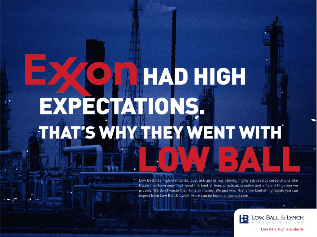
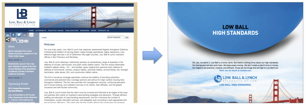 We updated the logo to include a ball, again to reinforce recollection of the name and included the tagline “Low Ball. High Standards.” Below is another straightforward option that shows how we considered using actual client case studies to provide evidence of their quality work. (Offline, feel free to ask me to show you the more striking variations that we rejected as too bold for their comfort level.)
8. StevensVirgin
While on the subject of firms with unusual names, we used a similar direction with Vancouver litigation powerhouse StevensVirgin. They hadn’t acknowledged the virgin in the room, but Mark Virgin, a leader in the local legal community, had a good sense of humor about it. (I can imagine some tough middle school years there.)
He was ready for the firm to stand out and show its friendly culture and personality, and having a sense of humor conveys a sense of quality and confidence. Weak or insecure organizations can’t laugh at themselves.
“Virgin” is defined as “inexperienced,” which is the last thing clients want in their litigators, so we leaned into it and redefined the term with a “Virgin means experienced.” slogan, brand, website, and marketing campaign.
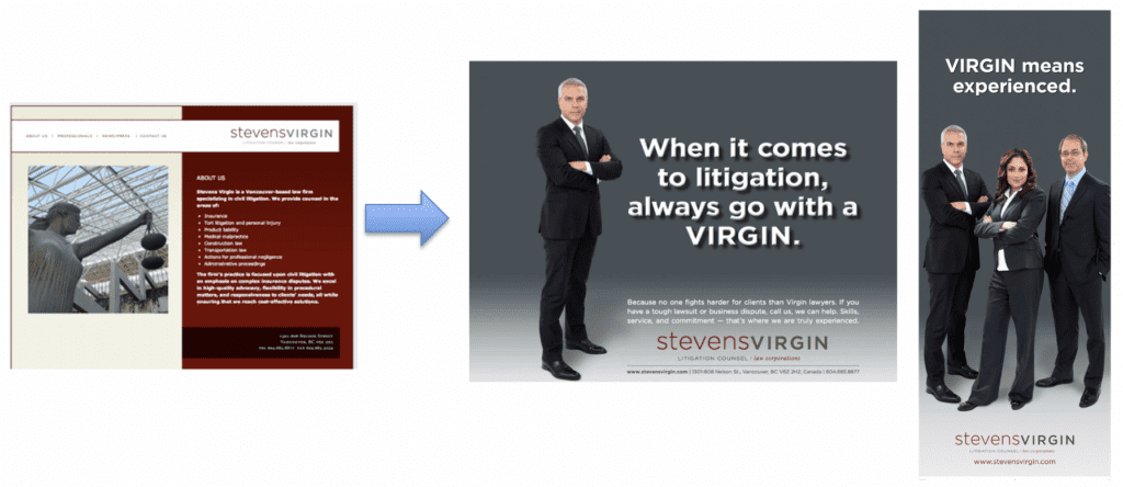
The firm’s booth at the Canadian Bar Association conference was a huge hit, and their “Go with a Virgin” coffee mugs were the favorite giveaway, quickly propelling them to national visibility.
9. Neal Novak, insurance coverage and reinsurance
Neal Novak is one of Chicago’s top insurance coverage and reinsurance lawyers, defending insurance companies in large and complex disputes. Neal helps determine whether or not the policy covers the claimed loss, and the company should pay. These can include arcane and nuanced language in enormous contracts, and he has to sniff out possible fraud and identify any potential defenses that would exempt the company from having to pay out.
It can be difficult, tedious work. But Neal loves it. He’s a brilliant but plain-spoken guy, a charming storyteller with a terrific sense of humor about the work. His clients regularly tell him that they love that about him. He wanted to express his style in his brand and website, intuitively understanding that in a dry practice area full of dry personalities, he would stand out.
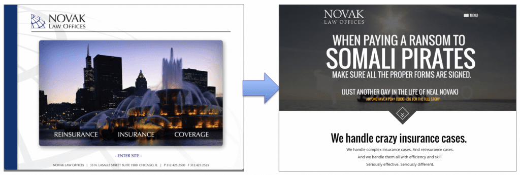
And by showing who he is, he would attract the right kind of clients, i.e. the ones with whom he’d naturally have good chemistry, leading to higher job, and client, satisfaction. If you don’t like his free-wheeling sense of humor, you’re not a good fit. It was our job to ensure not that he gets more clients, but that he gets more of the right clients. He loves his clients.
So, we asked him to regale us with his craziest actual case studies. What are his go-to cocktail party stories, the sure-fire winners? He had a bunch. We narrowed them to our favorite five and used the website home page to tell those stories in the most “Neal” way we could.
Like the one about his refusing to pay the insured ransom to a band of Somali pirates who’d hijacked a ship until the pirates signed the written agreement officially acknowledging receipt of payment (they had to go back to shore to get a pen!).
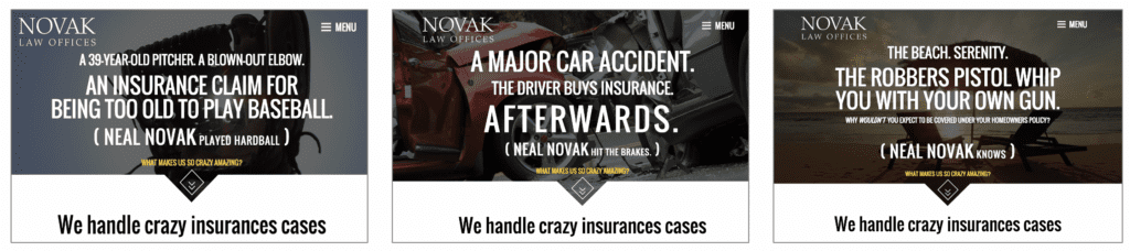
Or the driver of a car who got in a terrible accident and then bought insurance and filed a claim. Or the garage mechanic who got run over by a driverless truck.
We told Neal’s stories Neal’s way, using a “We handle crazy insurance cases” tagline. Because that’s who he is, and what he does. Because effective branding starts with true authenticity.
10. Litchfield Cavo
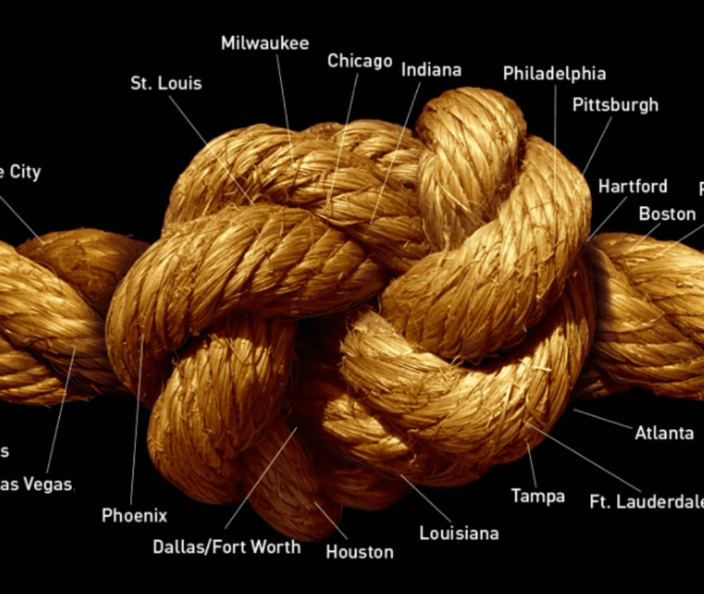
Litchfield Cavo is a 250-lawyer insurance-defense firm. Their clients are often national insurance companies that value having a skilled firm with a national geographic presence ― lawyers who work together as necessary across 23 offices coast to coast, from LA to Boston and Fort Lauderdale. Tough, efficient lawyers with great trial skills, they wanted to showcase their unique toughness and experience, and national reach.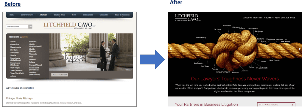
Insurance companies often complain that some litigators start a case with great confidence, then lose their nerve as a trial nears, requesting more settlement dollars. Litchfield Cavo lawyers don’t do that, they give a fair and accurate evaluation of the case, whether they recommend settling, and if so, for how much.
Then they stick to that. If a case should be tried, they say that upfront, and have the experience to try the heck out of it. We told that story with the slogan: “Our Lawyers’ Toughness Never Wavers”
The firm had a number of important differentiators that we wanted to emphasize, i.e. that Litchfield Cavo is (1) national, practicing in 30+ states.
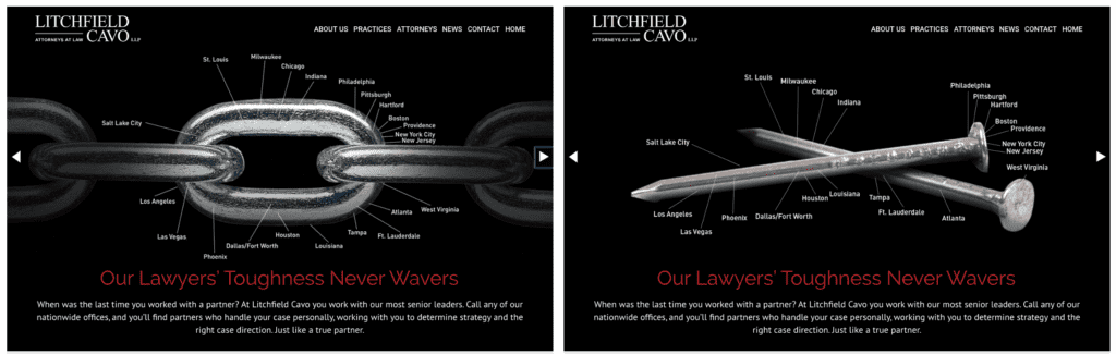 Also, that the lawyers are (2) tough, and boast (3) remarkable trial skills. Many of their lawyers have handled 100-200+ jury trials, ensuring that they won’t panic on the courthouse steps and seek more settlement money. That is, there will be (4) no surprises. The concept of “No surprises” is represented as a clear box tied with a ribbon.
And this behavior is (5) consistent across all offices. We wanted visuals that supported each of these important points. “National” was the fundamental underlying message, and we turned every graphic into a stylized map, creatively displaying their office cities in every image.
So what’s the point? Every firm is different.
And if your website has a skyline, building, smiling lawyers, or colorful abstract graphic on the home page, your marketing isn’t working. Isn’t it time you stood out? It’s time to showcase the quality of your work or culture. Help your prospects see how you’re a better choice than your competitors down the street. Doing the same old thing as everyone else is a missed opportunity.
There’s always something about every firm that makes it unique. Do you know what makes yours special? If not, you need to figure that out. If you need help, please call us to discuss it. Watch our video. Call Ross NOW to discuss it, at 847.921.7677.
Considering refreshing your brand or website?
Need an entertaining keynote, marketing training, or CLE speaker? Contact Ross Fishman ASAP at ross@fishmanmarketing.com or +1.847.921.7677.