
Objective:
Develop new home page banners and ads for the nation’s largest creditors’ rights firm. Create new message and visuals to update the firm’s existing website, without developing a new site.
Background:
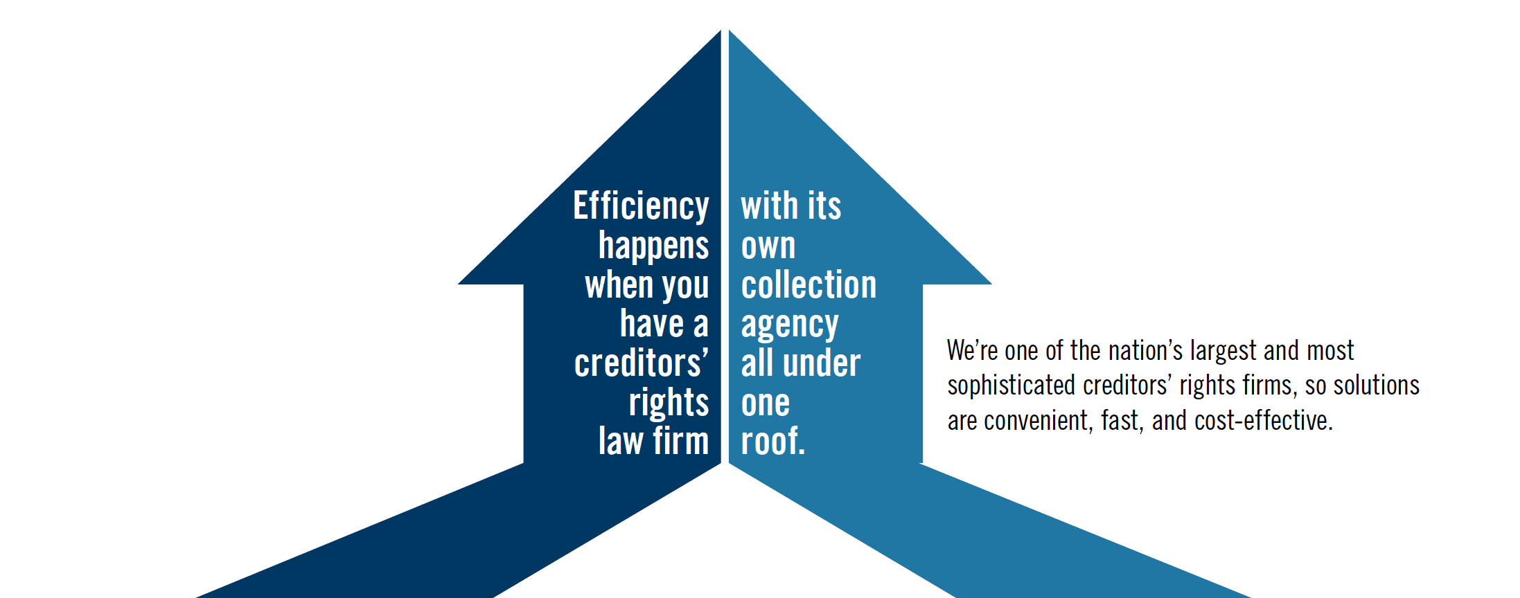
Debt collection is a vital part of the economy, ensuring that commerce flows freely and efficiently. Weltman Weinberg & Reis is the nation’s largest debt-collection firm, combining both a law firm and collection agency, with 700 skilled lawyers and professionals under one roof. We were asked to brand both sides of the business to help market to sophisticated companies and financial institutions from seven offices nationwide.
CASE STUDY
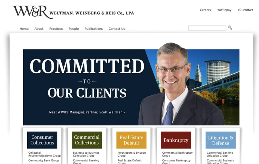
Their professionals are tough, skilled, and ethical, with some impressive differentiators against the competition. Analyzing their existing brand and website, the design was so bright and colorful it was almost cartoonish, poorly capturing a serious firm that does such important work.
Brand and visuals:
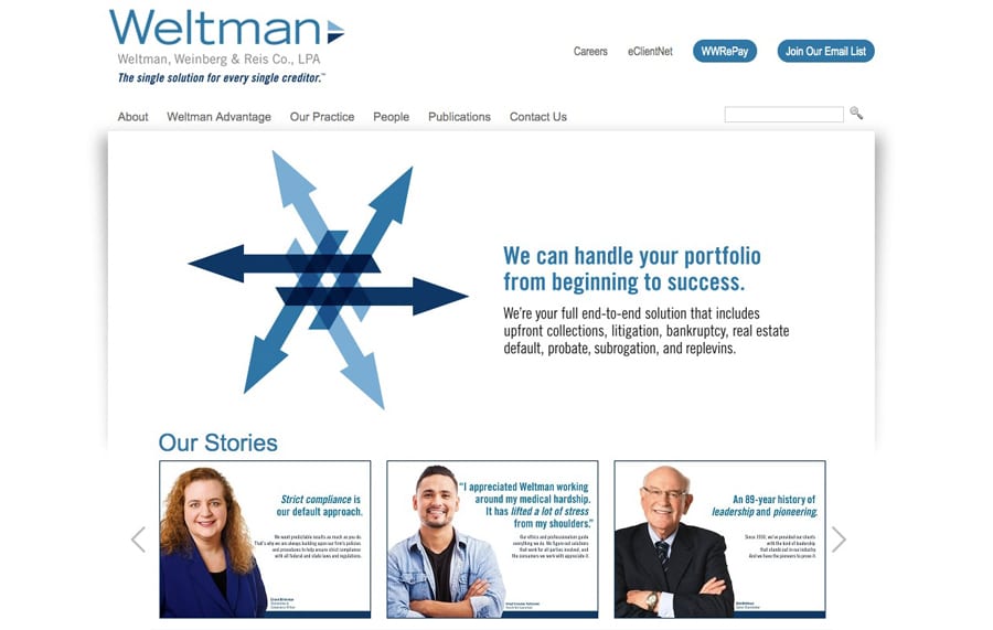
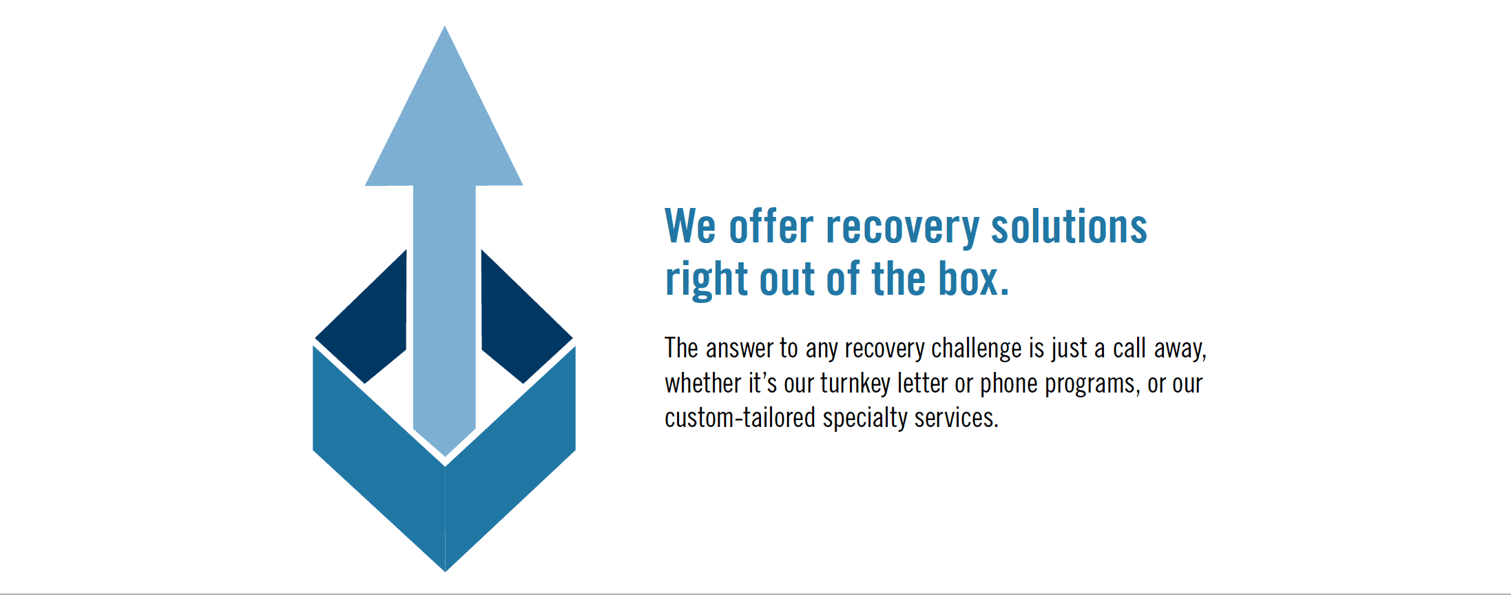
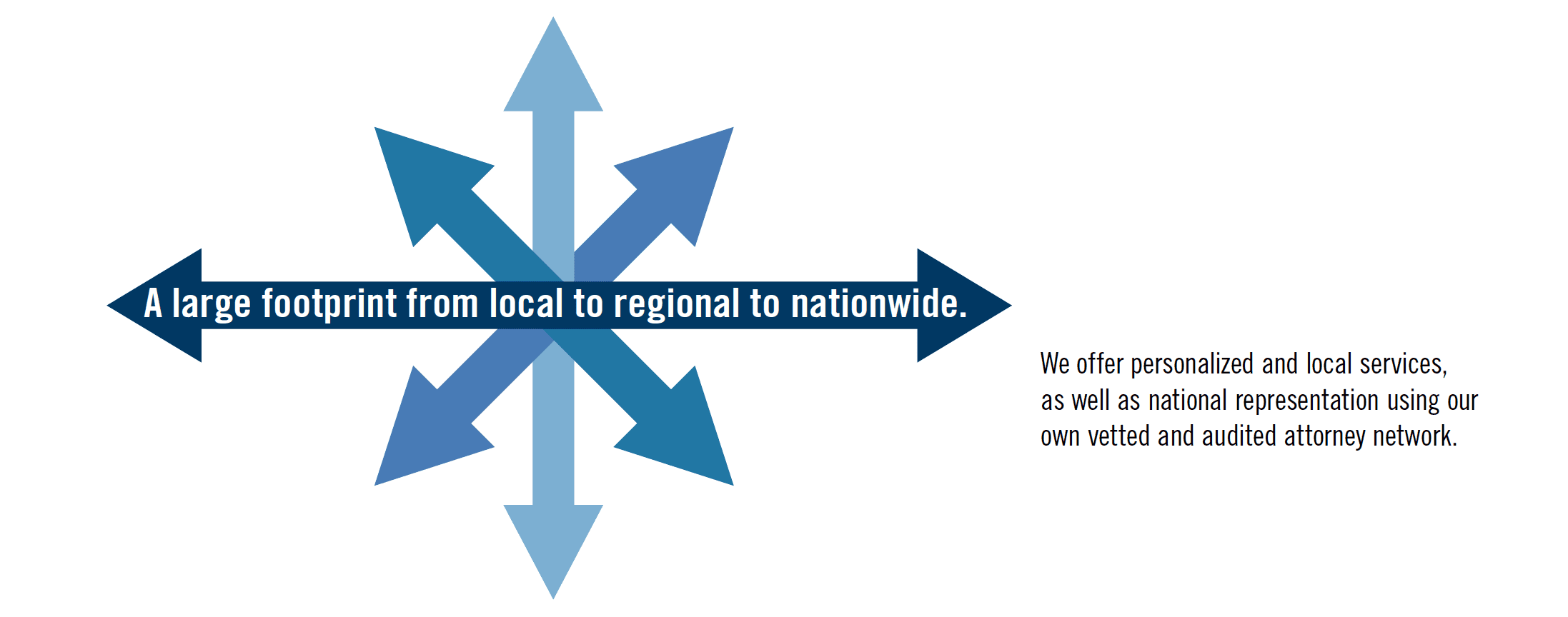
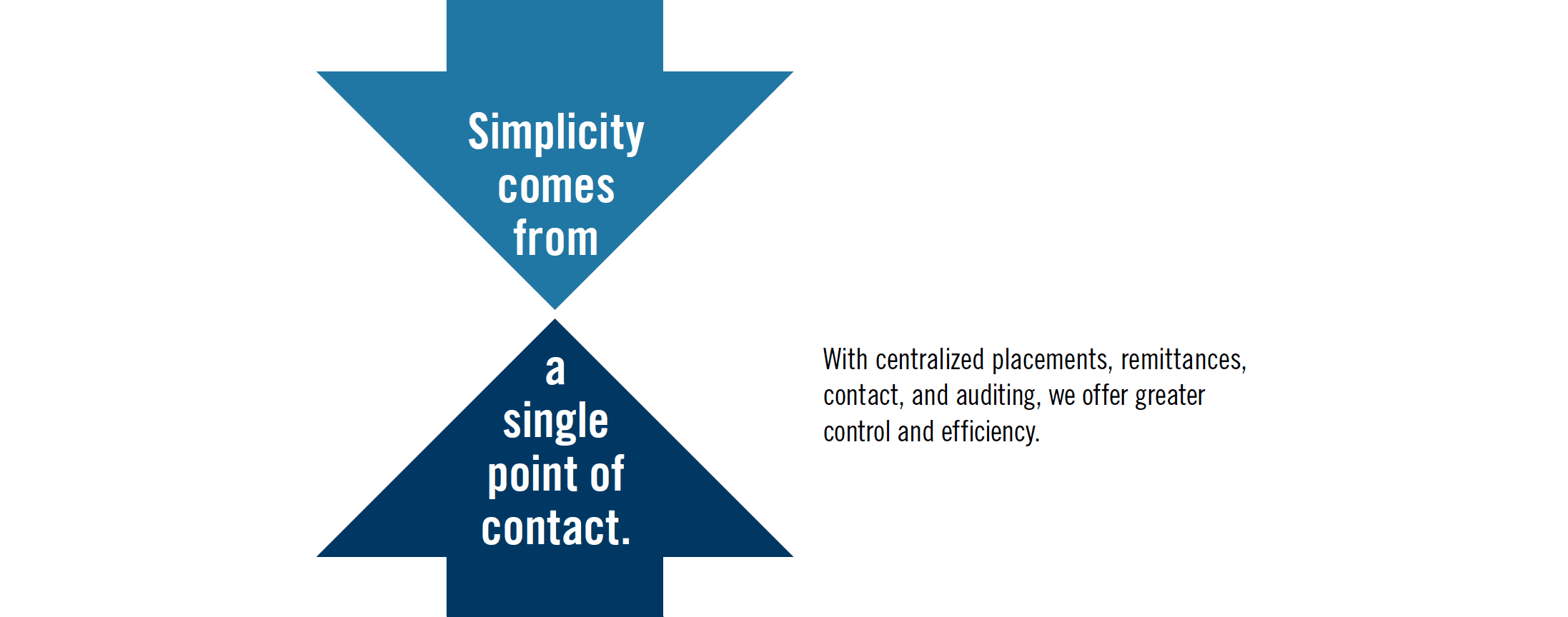
Our research disclosed the firm’s many differentiators. There were so many, in fact, that we highlighted each of them separately under an “arrows”-based design umbrella.
Our new tag line spoke to the strategic big picture, its one-stop-shopping benefit it offered to clients: “The single solution for every single creditor.”
Supplemental branding design.
In addition, we were impressed by their integrity and humanity. They’re tough when they need to be, but compassionate when they can be, not harshly squeezing people who are down on their luck. We know their big banking clients are concerned about their own image and it is important for them to be seen as tough―but fair.
We wanted to highlight this positive attribute as well and created a second complementary design that featured the firms’ actual professionals in both the law firm and collection agency. We included some quotes from actual debtors, who felt that they had been treated fairly and humanely. Our tag line was “A more human creditors’ rights firm.”

LOGO DESIGN
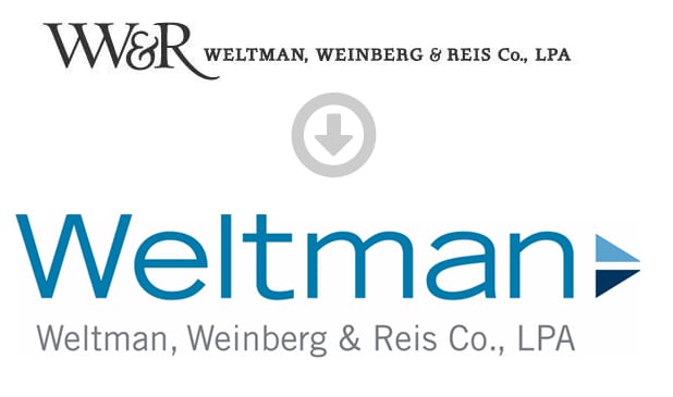
Their original logo had a distractingly large set of stylized initials, overshadowing the too-small firm name. The firm was known across the industry as simply “Weltman” and we recommended emphasizing that in its new brand. We picked up the primary Arrows design in their beautiful, modern, and colorful new logo.
