Tag lines are hard. Really hard.
They’re a small handful of strategically selected words that encapsulate everything you stand for and want your target audience to know about you. In this 3-part post, we detail some of our favorite tag lines, along with a bit of the background info for context (Click to read the new updates to parts One and Two.)
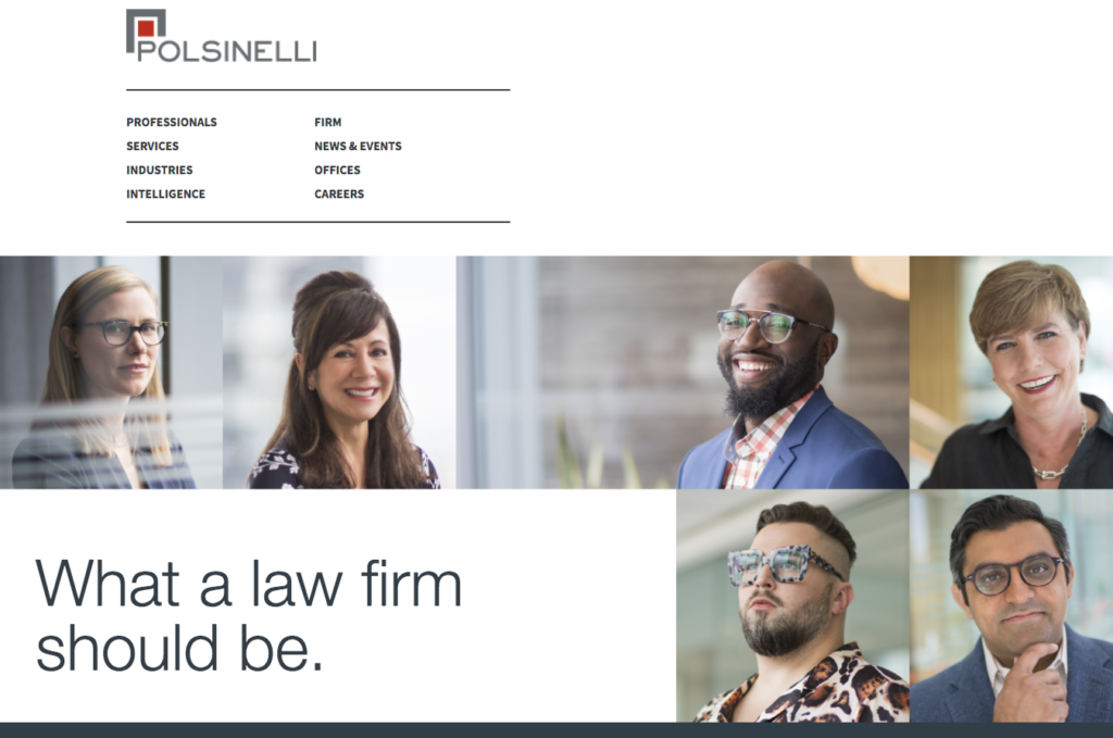
What a law firm should be.
950-lawyer Polsinelli is trying to create something truly rare―an institutional culture of humanity, diversity, compassion, and true partnership―so decent, supportive, and collaborative that the brightest, highest-quality people will clamor to join them. And so far, it’s been working; the firm’s growing fast, all in ones and twos, as like-minded lawyers and staff climb on board. Drafting this tag line was relatively simple―it just suggests the ideal environment they’re working to create. And the friendly homepage photos just have to express the personalities of their valued personnel, both lawyers and staff at all levels. Because if you’re going to build a welcoming culture, it shouldn’t just be about, or for, the lawyers.
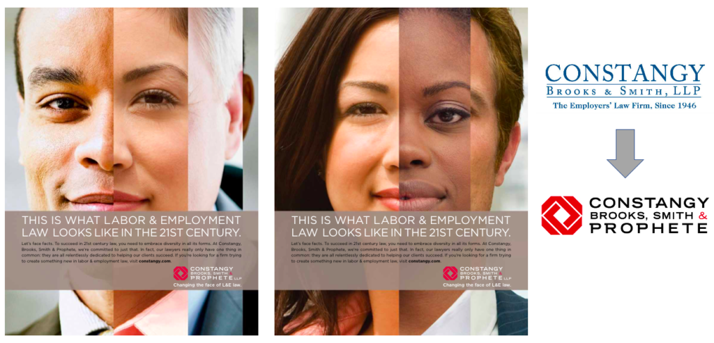
Changing the face of L&E law.
Diversity is a challenging issue for law firms. Most firms know it’s important, but often struggle to recruit and retain women and minority lawyers. The nation’s sixth-largest labor and employment law firm was making a sincere commitment to Diversity, and wanted to emphasize that, including creating a Diversity-oriented brand. The advertisements showed a striking composite image of smiling, confident lawyers.
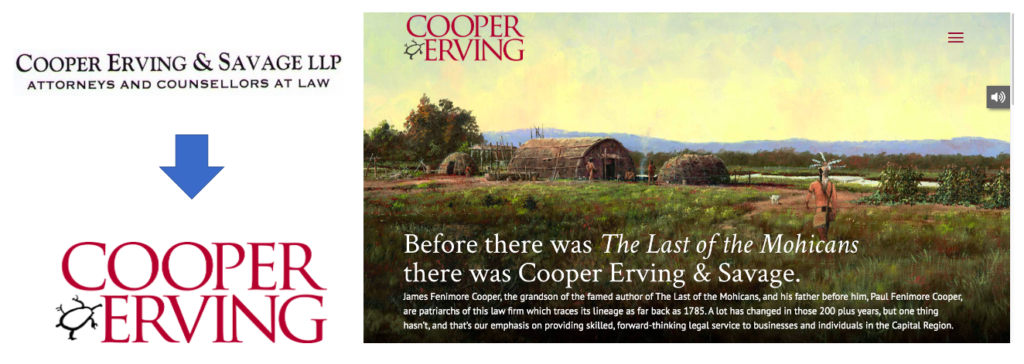
A 225-Year History of Success™
Founded in 1785, New York’s Cooper Erving & Savage is the nation’s second-oldest law firm. The “Cooper” in the name is the son and grandson of the famed American writer, John Fenimore Cooper, author of the book we all read in high school, one of the greatest American novels, “The Last of the Mohicans.” We wanted to connect them to the Albany region’s founding, and their amazing history. One of our favorite logos, we found a turtle pictogram that a local native American chief had used to sign a 1785 real estate indenture and incorporated that into the boldly colored logo (after first obtaining permission).
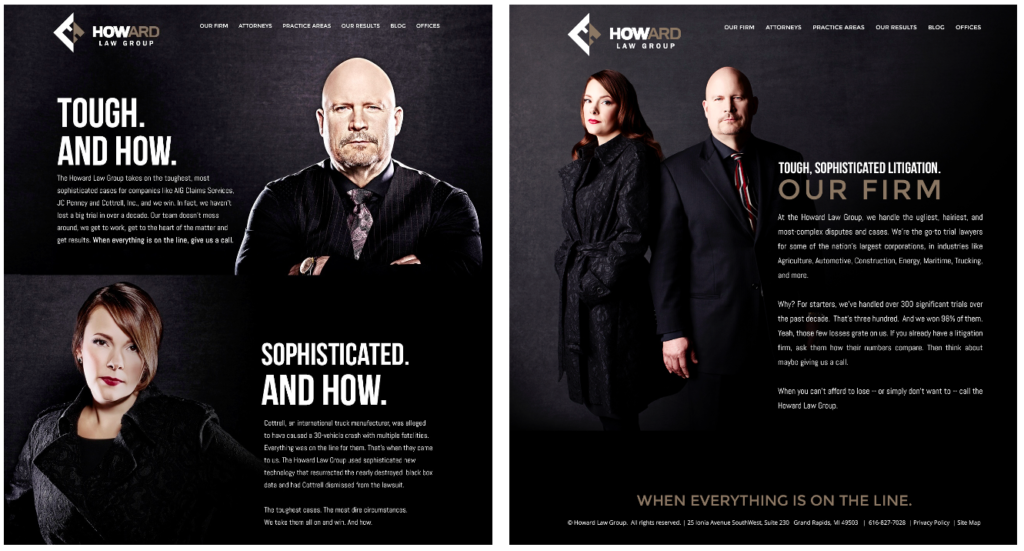
When Everything is on the Line
“When you can’t afford to lose, or simply don’t want to, call the Howard Law Group.” Among the nation’s top trial lawyers, Bill Howard has a remarkable 300-4 record in major trials. But The Howard Law Group’s website was a mass-market template from one of those high-volume companies. The bio photos looked like high school yearbook photos. They deserved much, much better.![]()
Bill’s a brilliant trial lawyer and his partner Jean Howard is smart and strategic. We wanted to do more than claim superior trial skills; we wanted the readers to feel it. So we used gritty photography and straightforward language. “…we handle the ugliest, hairiest, and most complex disputes and cases…. The toughest cases. The most dire circumstances. We take them all on and win. And how.” And when you have the facts, use the facts: “We haven’t lost a big trial in over a decade.”
And we redesigned their logo to emphasize the “How” in Howard, giving us the opportunity to use a second, supporting tag line in the headlines: “And How.”
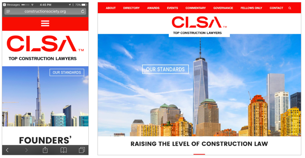
Raising the Level of Construction Law.™
The Construction Lawyers Society of America is a leading association of top construction lawyers. After designing a logo that recalled construction girders, we needed a theme to show that CLSA lawyers were among the nation’s best. So, the website banners show city skylines, where the tallest building pictured is called out with a “Our Standards” headline–a visual metaphor for CLSA’s rigorous vetting process.
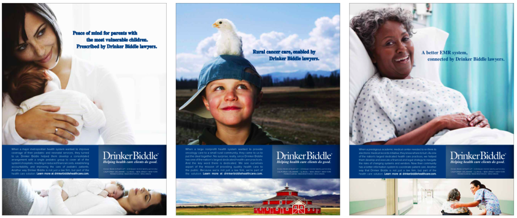
Helping Health Care Clients Do Good.™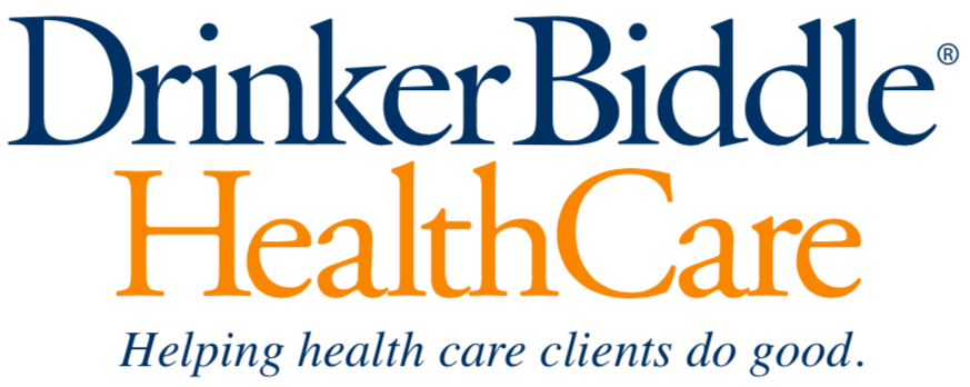
700-lawyer Drinker Biddle had one of the nation’s leading health care practices, but after a series of major mergers, they needed a cohesive message to tie their 14 disparate HC-related practices together. After interviewing dozens of their lawyers, we discovered that the practice had a significant presence in the not-for-profit sector. The lawyers closely identified with their clients’ mission of providing quality health care to the public; the lawyers proudly bragged about the good work their NFP clients were doing, and how honored they were to be a small part of helping them fulfill this mission.
We built the message and marketing campaign around their powerful stories. Using poignant (but inexpensive royalty-free) imagery, the case study-based marketing platform (1) describes the great work done in each of Drinker’s HC-related practice areas, and (2) shows the lawyers’ proud connection to their clients’ achieving their goals
This integrated structure allows each of the individual practices to tell their own client-oriented stories. Learn more here.
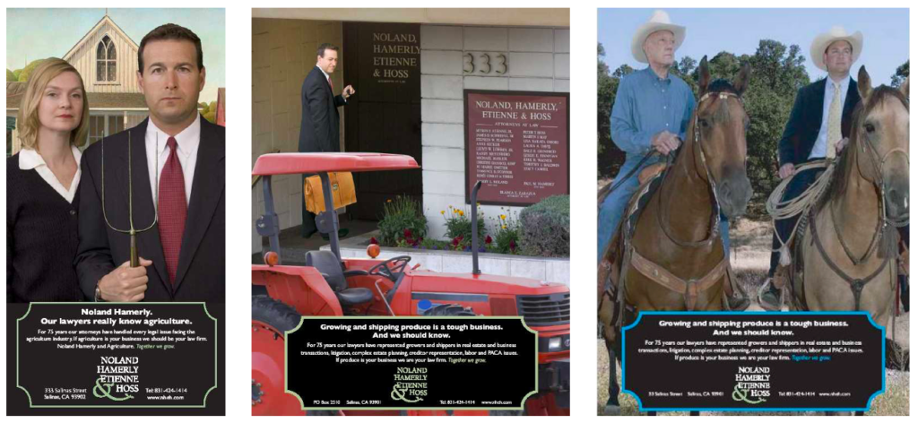
The Lettuce Lawyers.™
![]()
Noland Hamerly is a full-service firm in Salinas, the breadbasket of central California. They wanted to market their firm better, and we persuaded them that there was also a tremendous opportunity to seek to become the region’s market leader in the dominant agriculture industry, quickly leading to significant gains in revenue, profits, and prestige.
We knew that bestowing a creative name on the practice would generate more visibility and interest, so we alliteratively declared them “The Lettuce Lawyers.”
We had some fun with this, turning actual seed packets into business cards for conferences, and designing a little sprout into the industry group’s logo. This helped us generate dozens of feature stories worldwide. Click here to see the other Best of Show-winning marketing materials.
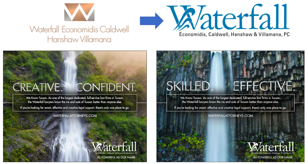
As powerful as our name.™
Waterfall Economidis, Tucson. One of Arizona’s leading full-service law firms focuses its marketing on its unique name, particularly during this tragic drought. Great lawyers and blessed with a positive and fortuitous name, this tag line reinforces both their name and culture. To reinforce the message, we changed the firm’s domain name from the hard-to-remember WECHV.com to simply waterfallattorneys.com (we rejected waterfalllawyers.com as having too many consecutive Ls, which could lead to confusion or typos). The website used beautiful videos of flowing waterfalls.
How Potent is Your Patent?
Sterne Kessler, Washington DC. Sterne Kessler is one of the nation’s finest intellectual property firms. Fishman Marketing was hired to develop a marketing campaign to help market their leading patent-prosecution practice. We particularly liked the tag line’s rhythm and how it focused on the effectiveness of their work. See the ads here.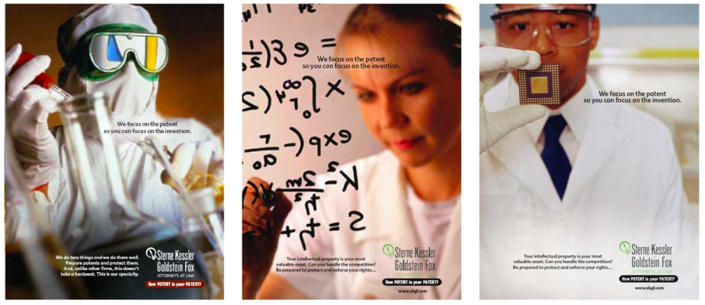
Legal Skills. Doubled.™
Glenn Feldmann, Darby & Goodlatte is a full-service law firm in Roanoke, colloquially known as “Glenn Feldmann.” The lawyers sought to brand the firm in the local market and hired Fishman Marketing to help. Two particularly marketable aspects of the firm are (1) its Double-N first names, and (2) that the firm name, Glenn Feldmann, sounds like an individual, a guy, rather than a firm. So for name recognition purposes, we thought we could use that.
Each Glenn Feldmann lawyer was a local leader in their respective practices, so we wanted to leverage their reputations and local visibility. We selected the firm’s name as the platform for the website, and the launch ads highlighted the Double-Ns in the names, to reinforce the firm name. To support the brand and tag line, we redesigned the hard-to-read logo with an elegant design that emphasized the important Ns.
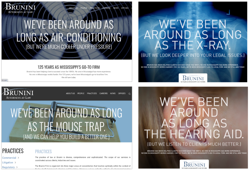
Mississippi’s Newest 125-Year-Old Law Firm
The terrific Brunini law firm is likely Mississippi’s oldest firm and we wanted to celebrate the firm’s long local history, while always looking forward. The firm is steeped in tradition, but not tied to it. Our tag line reflects this while having some fun with their history by showing what it means to be this old, e.g. “We’ve been around as long as the X-ray. But we look deeper into your legal issues.”
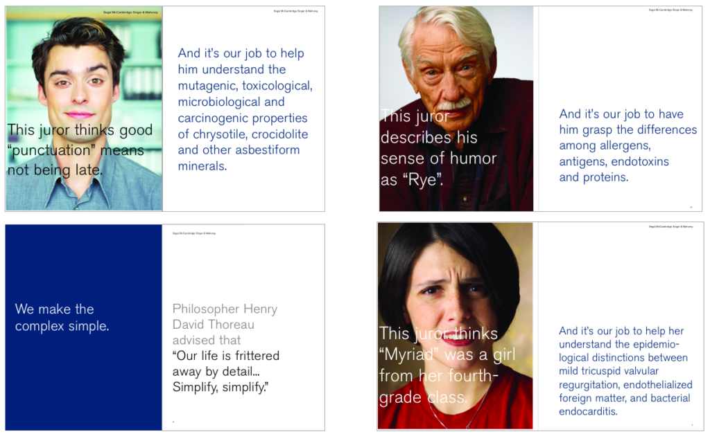
We make the complex simple.™
National class action defense firm Segal McCambridge emphasizes winning at trial by simplifying the issues for the juries in complicated cases. They’re not mocking the jurors. They’re simply recognizing that MDL litigation in class actions over asbestos, latex gloves, and other issues involve extremely complex biology and anatomy, as well as hyper-technical legal and procedural issues. And to win, they have to explain all of this incredibly complicated legal and scientific info to a lay jury. Segal McCambridge lawyers win because they excel in that skill.
Many insurance company clients actually requested additional copies of the clever firm brochure and marketing materials to send to their friends and bosses. See the award-winning marketing materials here.
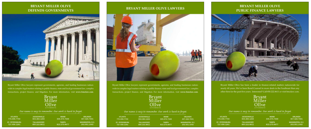
Our name is easy to remember. Our work is hard to forget.™
![]()
Bryant Miller Olive was a finance-oriented firm that had earned solid awareness in their local markets inside Florida. But when opening their first office in a new city, they needed a simple marketing initiative that would help them build name recognition quickly and cost-effectively, for both client development and lateral hiring.
When you have a good word in your name, it’s worth exploring whether it’s beneficial to use it in your marketing, to make it more memorable (like StevenVIRGIN in Part 2, here). When you see the giant Olive, you notice and remember it. We even changed the logo to dot the I with a small green olive. See the award-winning marketing materials here.
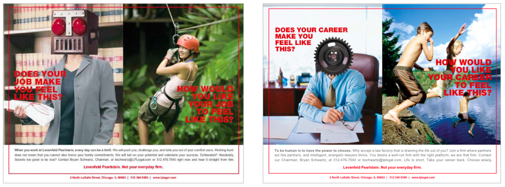
Not your everyday firm.™
If you’re going to claim that you’re different or better, you need to prove it. Chicago’s Levenfeld Pearlstein is different. An aggressive firm with bold leadership, they built a firm that was intentionally and vigorously focused on its culture. They wanted to attract a certain type of dynamically entrepreneurial lawyer, and we boldly juxtapositioned two contrasting images–a metaphor of bland legal work (e.g. a sheep, cog, or robot) against examples of thrilling, heart-pounding adventure, like white-water rafting, zip-lining, and cliff diving.
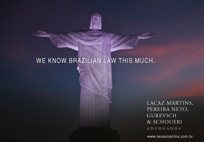
We know Brazilian Law this much.
A short-term marketing initiative to help Brazil’s leading tax law firm build visibility across South America for inbound referrals, we wanted to help brand the firm by connecting it to Brazil. Among the most iconic images representing Brazil is Rio’s 125-foot statue Cristo Redentor (Christ the Redeemer), and we used it in a light-hearted way. We knew this theme might be considered indelicate in the conservative United States, but was appropriate and appreciated across South America.

Conclusion
Consider whether your tag line could apply equally to most of your closest competitors. If so, your marketing is missing one of its best opportunities to stand out and show your value. Take a step back, rethink your strategy, and focus on a message that helps you stand out and achieve measurable ROI for your marketing investment.
How does your tag line or website compare?
Book Ross as a Speaker Now!