
What’s the MOST-important info to add to your marketing?
We all notice effective marketing. It commands your attention and makes it impossible to miss. We don’t even notice that we’ve noticed; we just subconsciously read or remember it.
As a branding consultant, I pay particular attention to the ineffective efforts. I read the bad banners and the invisible ads — the ones that don’t work. You can learn a lot by deconstructing failed attempts.
Here’s an especially bad example I encountered at the Cleveland Airport.
Take a look at the billboard below — a quick glance like you’re hustling to your flight. Do you want to call and hire these guys? Do you even know what they’re advertising? No, you don’t. Rookie mistake.
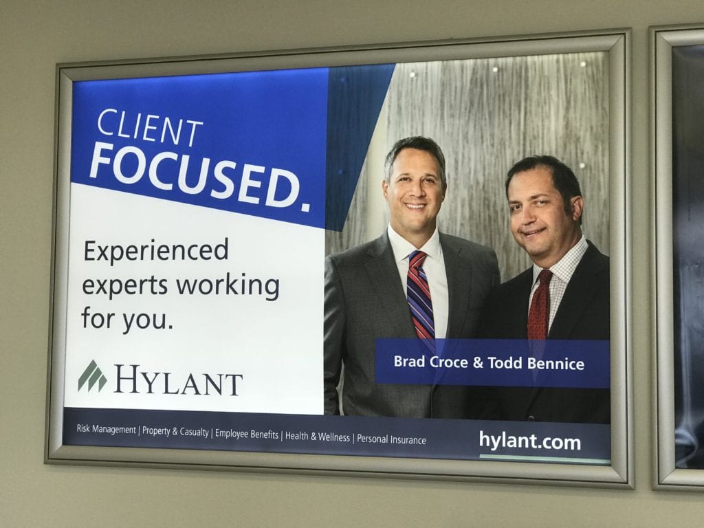
Let’s analyze the ad: Two average guys in suits. A broad “Client Focused” headline and “Experienced experts” subhead. <yawn> A typical logo. Are these chipper guys consultants, accountants, realtors, bankers, or lawyers? There’s simply no way to know. (Even the names “Brad & Todd” seem intentionally commonplace.) Do you want to hire them? Has it compelled you to call them? Nope. The list of their services is in tiny, unseen type at the bottom. This ad is an expensive, squandered opportunity. Marketing malpractice.
Unless you’re as well known within your target market as Nike, Marlboro, Coke, or Beyonce, I suggest shouting your message to the heavens.
Ross’s First Rule of Advertising: Make it impossible to miss what you do.
A law firm example — in Chicago, a number of new regional and national law firms are advertising to attract clients and laterals — but don’t mention that they’re law firms. The headlines promise that they “are excellent,” or “represent businesses” or “are growing.” But few of their target readers in Chicago will have heard of these out-of-town firms. And if you don’t clearly identify the industry, relevant readers won’t bother reading the ads. Unless it’s obvious that it applies directly to me, I won’t waste my precious time reading it.
The airport billboard above is a typical example. It’s in the main hallway in a busy airport. The target readers are racing to or from a flight, so they’re unlikely to read the fine print without an especially compelling graphic or headline. Your ad must be so extraordinary that busy people will stop in their tracks and read it. That’s a very tall order. “Experienced” and “Client focused” are never that powerful.
Or how about the ad below — no headline, just blocks of gibberish.
Farther down the same terminal is a billboard that looks designed by the company’s engineers. Do you know what company it is? What they do? How they’re better than their competitors? Of course not, it’s awful. No message or focal point:

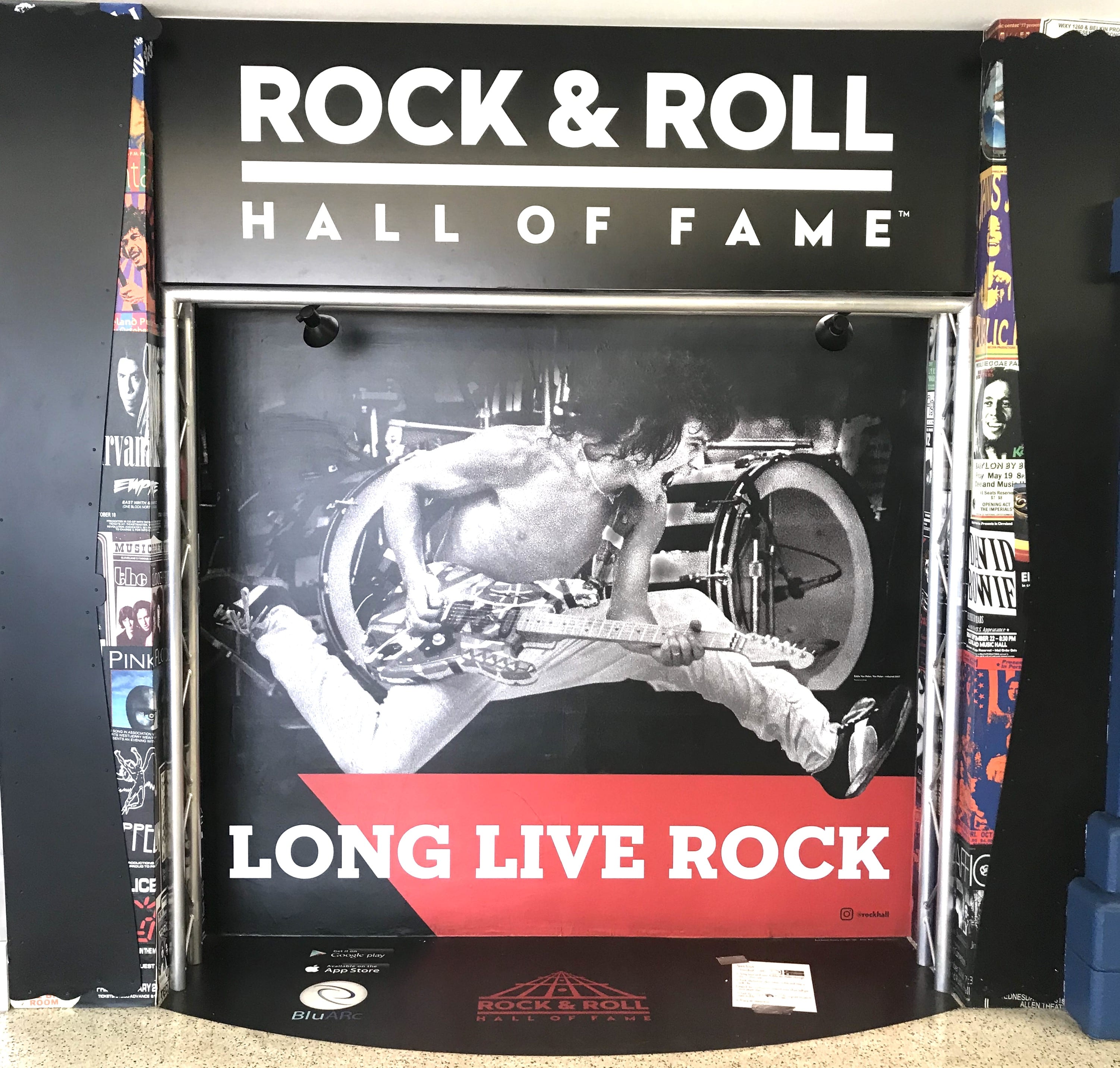
Now look at the one below.
No explanation necessary. An eye-popping photo and six-word headline. Three words of text: “Long live rock.” Boom. It says everything you need to know and gets you pumped up to experience their product. Big difference.
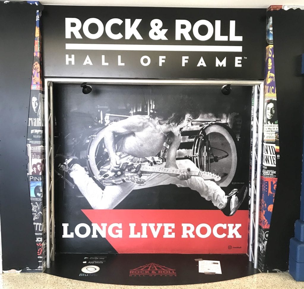
Sure, the Rock & Roll Hall of Fame has an advantage — an exciting product. But they could have squandered it with a posed photo of a group of smiling musicians and a “Visit our Museum” headline. Fortunately, they know their audience and how to motivate them to buy.
Compare the two billboards, side by side:

It costs just as much to do it well as badly. Why choose to do it poorly?
 ———————–
Need a new brand or website?
Start by reading the definitive book on the subject, “We’re Smart. We’re Old. And We’re the Best at Everything. The World’s First No-BS Guide to Legal Marketing and Branding” available at Amazon here https://www.amazon.com/%2522Were-smart-Were-old-everything%2522/dp/0997967633/ref=asap_bc?ie=UTF8
Contact Ross directly for more information at +1.847.921.7677 or ross@fishmanmarketing.com
