
What the Hell is This Ad Selling?
Today’s winner of the latest “What the Hell are They Selling???” award is THIS ad I found for “The Moses, Bertha & Albert H. Wolf Fund”
First, let’s discuss some things that make an advertisement effective:
An effective ad presumes that readers do not know the company or what it does (unless it’s obvious, like McDonald’s or Nike). 
It commands your attention with an eye-popping visual; it grabs you by the lapels and shakes you, to fight through the publication’s visual clutter. No generic cliches or “safe” images.
The headline compels you to keep reading; it is somehow unique, clever, or intriguing.
In a two-second skim of the headline and graphic, it tells you everything you need to know. You’ll know if you’re in its target audience, and the basic message.
Unfortunately, perhaps 90% of any publication’s ads, are so bland that they’re effectively invisible. Few readers, if any, notice them; they fail to register on your consciousness. Any memory of their existence vanishes when the page is turned.
Among the few who do notice the headline, ~80% or more of them won’t bother to read the paragraph of explanatory text. So you must tell readers who you are, what you do, and what you want them to know in the headline or you’ve wasted most of your money.
In other words, the headline is your only shot.
Don’t squander that valuable resource with something ambiguous or obtuse.
For that reason, at Fishman Marketing, we try to find a way to include (1) the firm’s name, and (2) the word “Law” in every headline. Sure there are exceptions, but you can’t finesse the rules until you have thoroughly mastered them.
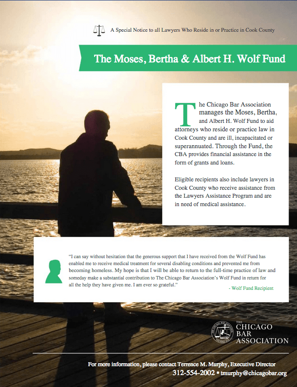
So let’s look at the Wolf Fund ad again. How many of these must-haves does this ad include? None of them.
The vague visual doesn’t grab you. It’s fine, but it doesn’t clearly tell readers what product or service they’re selling, or who the ad is intended to target — it’s a generic guy looking at water. So the headline must work harder to grab you and convey the message.
The green headline is simply a bunch of names.
Actually if you were to bother looking more closely, you’d see that it’s actually the name of a “Fund.”
But it doesn’t say who, or what cause, the fund supports.
So most of its target audience will flip right past it without realizing it applies to them. Few of its targets will stop and exclaim:
“A man in silhouette and some names I don’t know?
I must read the fine print to learn more!”
The tiny text at the top, next to the tiny scales of justice icon, “A Special Notice to all Lawyers Who Reside in or Practice in Cook County,” is too weak to even get noticed. Nothing above an ad’s most-powerful visual element (here the strong green bar) gets noticed. Gravity and habit pulls your eyes down, you rarely go back up.
If you were to choose to read the text, it doesn’t tell you to whom this ad applies until the fifth line of text, i.e. Cook County lawyers who are “ill, incapacitated, or superannuated.” (Sorry, who says “superannuated?” Who knows what that word means? Why not just say, “too old to work?”)
The headline should somehow convey,
“Cook County lawyers! Are you ill? There’s financial help available!”
So does this ad achieve its goal?
Does it inform disabled Chicago-area lawyers that financial assistance is available?
Probably not.
And that’s a shame.
Because if you were to learn what this fund does, it sounds pretty great.
