
Above the Law, one of our favorite legal publications recently wrote:
“There Are A Whole Lot Of Terrible Law Firm Websites.
“Some of the worst (and best) law firm websites.”
“A lot of the stock imagery we employ here at Above the Law is hackneyed on purpose. We put gavels and scales and federal reporters everywhere because we know they’re cliché. But some law firms just don’t get it and keep advertising themselves with the same boring imagery.” More here.
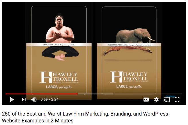
ATL’s Joe Patrice, wrote about our 20th anniversary video, which showed 250 fast-paced examples of what we’re calling “some of the best and worst law firm ads, brands, and WordPress websites.” The quick-cut video opens with 150 websites in 20 seconds showing many of the most-obvious cliches used by law firms on their website home pages, i.e. smiling lawyers, skylines, columns, books, gavels, and scales of justice.
The video continues with some of our favorite law firm advertisements, brands, and websites from all types of firms compiled over 20 years of Fishman Marketing. We think it’s a pretty compelling case. Take a look!
