STAND OUT – It’s not about the fanciest photos
There’s a disturbing trend in law marketing where the advertising/design/branding agency builds a highly visible campaign around a series of eye-catching photos. They can be crazy animals, or people acting weirdly, or all sorts of things. This can be effective, although having its agency sort through hundreds of $5000 Rights-Managed photos is hardly the strategy a firm should build its brand upon.
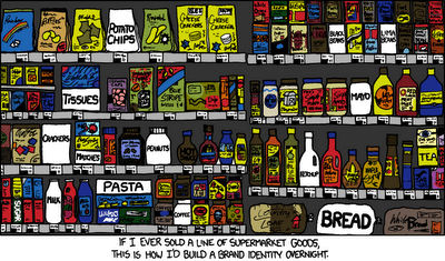
Here’s one of my favorite comics – XKCD. It’s smart, sophisticated, and tech savvy. This one makes the point that it’s not about the colorful label, it’s about standing out from the crowd of competitors, wherever you compete against them.
When we design an ad campaign, for example, we try to determine where it will be placed first. Sometimes black and white works better than color. In some highly visual publications or contexts, all-text can work better than photos.
One thing I especially like about XKCD is the mouseover comments that add context to the strip: