
I have mentioned previously my dislike of logos with big initials or unnecessary marks. When we’re redesigning a logo as part of a branding or marketing campaign, we try to emphasize the firm’s colloquial “street” name, i.e. the thing everyone calls you. That is, when referring to your firm, what do they say? “Brittany works at Skadden Arps Slate Meagher & Flom.” Or “… at Skadden.” Or even “… at SASMF.”
The marketplace has already decided what to call you. You don’t have a lot of say in the matter, generally. Your job is to simply acknowledge the obvious; it’s very difficult to persuade everyone to change their minds. The question is also whether there’s really a sufficient strategic advantage to make it worth the effort to try. And hopefully your firm also owns that website domain name, e.g. skadden.com or skaddenlaw.com or some close permutation.
Many firms refer to themselves internally by their initials.
When I was a young lawyer, I worked at Pedersen & Houpt. Internally, we called ourselves “P&H.” But if I’d told a random lawyer or executive on the street that “I work at P&H,” no one would know where I meant. “P&H” had no outside meaning, that wasn’t the firm’s brand. So using a giant P&H logo would have made no sense.
Your primary marketing goal is to be visible and memorable.
Your design decisions should facilitate that. The old “before” logos fight against it, highlighting something meaningless (the firms’ initials), and worse, distracting the viewer from what the firm’s “real” name is.
Laner Muchin, a top labor & employment boutique.
That is, no one ever called them “LMDBLT,” and we didn’t want to use the entire, unwieldy “Laner Muchin Dombrow Becker Levin & Tominberg.”
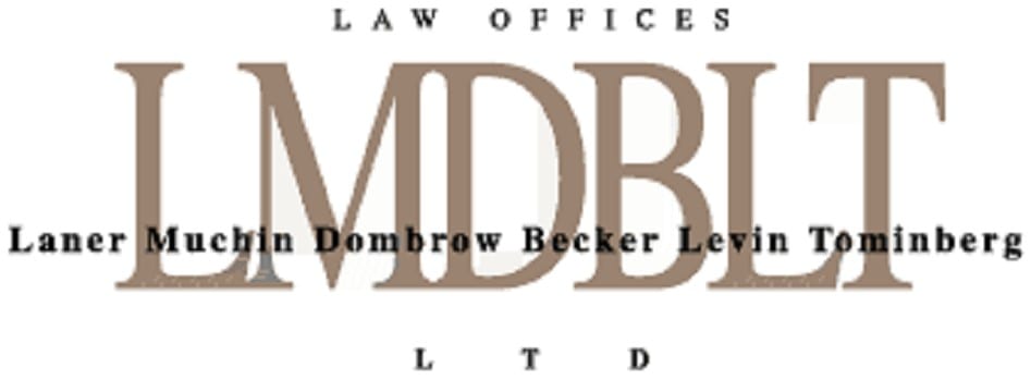
In the “after” example below, the shorthanded name is the primary focus. It’s what nearly everyone outside called them. Some used just “Laner,” but statistically more included “Muchin,” so we did too. Further, we built the firm’s marketing differentiator right into the logo–a stylized clock. This references the firm’s remarkable responsiveness – that all Laner Muchin lawyers return every call or email within two hours. Here, the mark/glyph adds strategic meaning to the logo; it’s not just a distracting design affectation:

Shortening a logo is not easy, the other prominent lawyers on the existing logos must agree to take one for the team. They must let their name be visually reduced in size, for the good of the firm. That’s not always easy.
Galloway Law Firm
Below you can see the before-and-after versions of the Galloway firm’s logo shown at the same width. Galloway Johnson Tompkins Burr and Smith was using an egalitarian design that grabbed your eye with large initials of the firm leaders. The problem, of course, is that no one knew the firm as “GJTBS.”
As you could probably guess, The Street called them simply “Galloway.” No offense to Messrs. Johnson Tompkins Burr and Smith, it was simply that Galloway’s name ran first and it was strong and memorable enough to stand on its own. And if that’s the case, then that’s where the discussion ends. “Galloway” it is.
And Galloway also has a nice little marketing hook built into it, the word “WAY,” which allowed us to talk about the Galloway of doing business.
————————
Need to enhance your OWN recruiting? Call Ross now!
Contact Ross Fishman directly for more information at +1.847.921.7677 or ross@fishmanmarketing.com
For more info, download a free copy of the definitive law firm branding book, “We’re Smart. We’re Old. And We’re the Best at Everything. The World’s First No-BS Guide to Legal Marketing and Branding” available at Amazon here.
![]()
