Can you claim to be a creative firm if your home page shows a skyline?

As a group, lawyers are quite literal, often too literal for good marketing.
As a result, more than half of law firms simply illustrate their website home pages with the obvious icons that represent the general concept of “Law,” like columns, jury boxes, striped books, rowing, and “Smiling Lawyers.”
The four most-prevalent explanations seem to be:
(1) “Our website developer recommended this.”
(You evidently hired the wrong developer.)
(2) “We didn’t know what else to do.”
(Then find someone who does.)
(3) “Well, if everyone else is doing it this way, it must be right.”
(Does your business card say “Lawyer” or “Lemming?” Stand out! Excel!)
(4) “No one hires us because of our website. It doesn’t matter what it looks like.”
(It’s a bit circular to create bad marketing, then say, “See, marketing doesn’t work.”)
Your marketing should set you apart.
Good marketing can help you stand above the crowd. It can show how you are different, or add more value than your lookalike competitors. But doing exactly what all the other firms do simply buries you in the anonymous middle. Sure it’s “safe,” but safe doesn’t create market leadership.
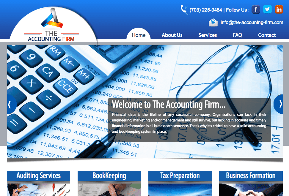
Here’s a random accounting firm’s website, illustrated by tax forms, a calculator, eyeglasses, a pen, and paper with columns of numbers. Do you feel assured that their CPAs will find the innovative solution to your challenging financial issues? Are you compelled to read the “About Us” section or click to learn about their Services?
(Really, think about it — how do you feel about their skills and creativity?)
That is, if your website’s home page shows a skyline or column, aren’t you telling visitors that (1) your firm is extremely average, and (2) there’s absolutely nothing worth reading inside? If you want to claim to be an A-tier firm, then you must look like it — and a photo of a handshake, building, or chessboard won’t cut it.
There are no exceptions — unless you’re a Wachtell or Cravath.
With their hard-earned reputations, they have nothing to prove. Bad marketing doesn’t hurt them as much as it does most other firms. But keep reading if your firm doesn’t yet possess a Wachtellian level of credibility.
So here they are, the 25 most typical and tedious photos law firms use — followed by what I think these icons actually convey to the average website visitor.
The Top 25 Visual Clichés:
[The Image:] 1. Globe/Map (Always featuring North America)
[What it means:] “We did a deal in Toronto once.”
- Firm handshake (Usually diverse in some way. Rarely two white men.)
“We’re your partner.”
- Building (My favorite is when it isn’t even the firm’s building!)
“I did it, Maw! I work in a building!”
4. Smiling lawyers (See “The Smiling Lawyers Website Trap” blog post here)
“We must be smart because obviously we’re not photogenic.”
(The worst are the group shots. Play the “Find the grimacing lawyer” game.)
5. Skyline (or alternating skylines, for firms with multiple offices)
“We work in a city!”
(Is that a dispositive hiring issue? Has any prospect ever thought, “If I could just find a lawyer who worked in a city — that’s who I’d hire!”) Bridges are a related variation.

6. Gavel (often resting on a striped book)
“We’re small-firm, small-town lawyers with a cheap template website.”
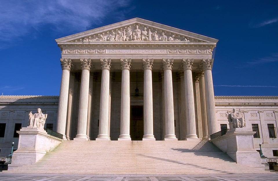
7. Columns/Courthouse
“We’re a law firm — here’s our column.”
(Yeah, we get it. <yawn>. This category also includes empty courtrooms and jury boxes.)
8. Light bulbs (formerly incandescent, now they’re swirly energy-efficient fluorescents)
“We have good ideas.”
(One such “good idea” might have been hiring a better branding firm. Just sayin’.)
9. Chess pieces (the king is often lying on its side)
“We’re strategic.”
(Why is the king sitting in the middle of the board so early in the game here?)

10. Diverse conference room (Everyone is perky and gorgeous. There’s “one of each.”)
“We know how much clients value Diversity. So we spent $10 on a stock photo.”
(Other “Diversity” options include flags, crayons, colored pencils, and a circle of hands.)
[That’s Part 1. We’ll detail clichés #11-25 in Part 2.].
Click to subscribe to receive Part 2 by email.]
————————
Looking for a highly rated speaker for your conference, marketing training, or CLE? Contact Ross Fishman at +1.847.921.7677 or ross@fishmanmarketing.com. Click here to see a video of Ross in action.