Very hard, actually. If you want it done right.
We haven’t heard it phrased exactly like that, but that’s the implication: “We designed our last logo all by ourselves in Word, and it looks just fine. Why should we pay you to design it?”
Why? Because an amateurish logo is your entire firm wearing a cheap suit.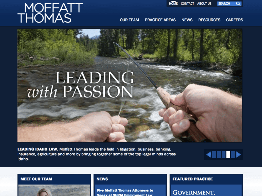
Of course, no one ever hired or fired a law firm because of its logo, but it’s sitting prominently on your business card and website. It’s one of the first things people experience about your firm at a critical time, i.e. when they’re looking for any indicia of quality (or lack thereof). It’s an important component of your first impression.
It’s understandable that people think logos are easy to design – “they’re just words,” after all: Pick one or two different standard Word fonts, bold or italicize part of the name, center it, then add a color. Boom, done.
It seems simple. But it’s not. Not at all.
Here’s an example. Some years ago, we rebranded Moffatt Thomas, one of Boise’s finest law firms (Moffatt merged in 2017 with Hawley Troxell), including an ad campaign and robust WordPress website. We eventually settled on a “Leaders” theme and needed a fresh, modern new logo to match.
A good designer juggles many different variables like, shape, balance, and utility. Consider the capitalization style, centered or offset, thick or thin, serif or sans serif, two lines or three. We kept a blue color for historic continuity, but updated the particular tone.
Here’s the original logo they’d been using for roughly 20 years:
![]()
To us, it just lacked style. There was no balance. It italicized typeface was a big hard to read, and the all-caps firm name extended far beyond the margins of the top line, and farther off to the right side than the left. It didn’t convey strength, quality, or leadership in the way we’d want for this fine firm. So we explored a variety of options, using different typefaces and layouts.
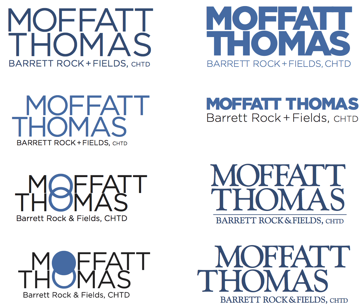
Below are just some of the rough first drafts:

We eventually selected this version:
![]()
Well-designed logos are eye-catching, balanced, and nuanced:
You can see some of the subtle ways a skilled designer manipulates the many variables to create a pleasing balance. Many of these would not have worked if he’d used a different font or lower-case letters.
![]()
Here is the before-and-after comparison:
![]()
Obviously, an updated logo can convey a professional image.
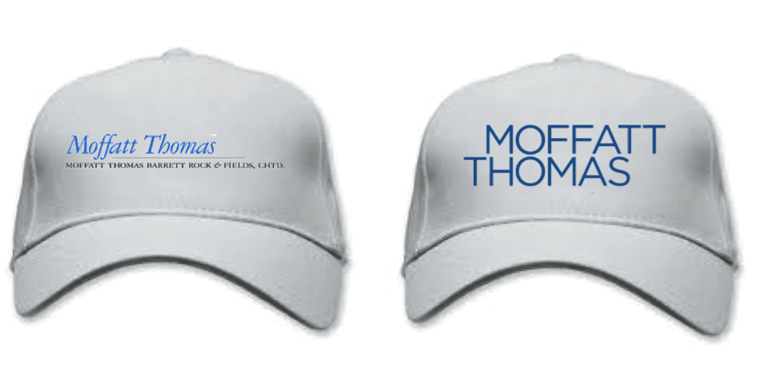
Generally, a logo is stronger if the names are on two lines.
It allows you to enlarge the size/height of the words if they can each extend to the full margins:
![]()
And in a high-risk professional-services industry where the buyer can’t “try on” the service or take it for a test drive before buying, the little things matter more. Your logo is a subtle indicia of quality.
You wouldn’t wear a cheap suit to meet with a hot new prospect.
Don’t let your logo or business card be that cheap suit.
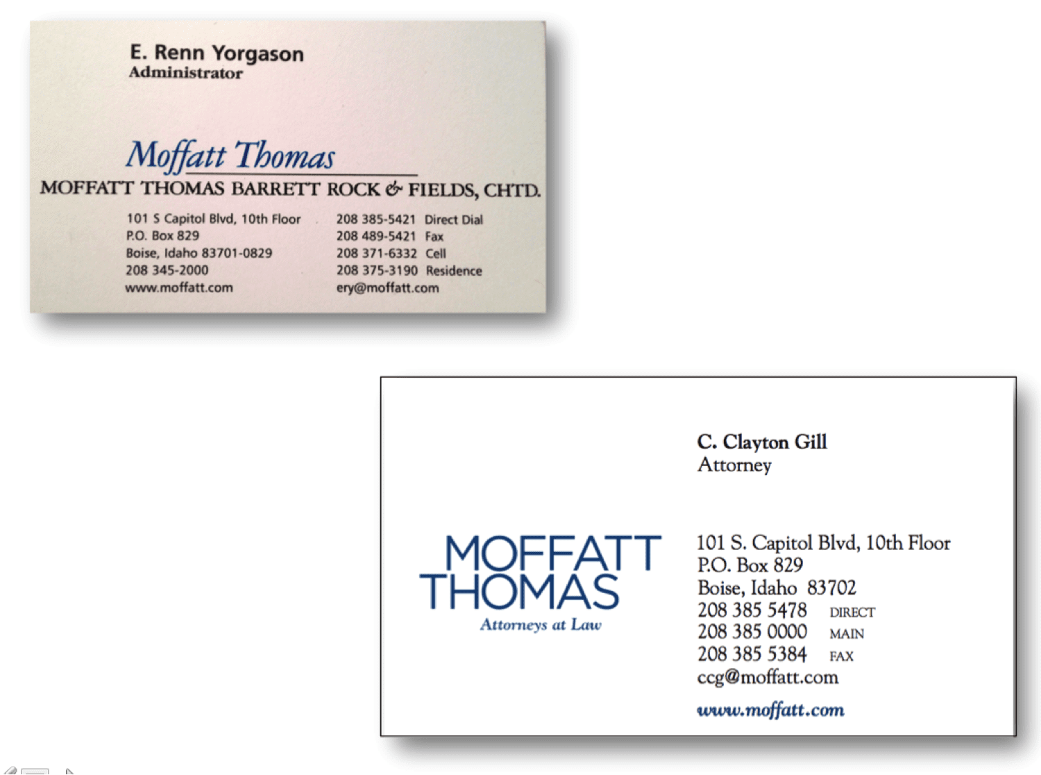
Here are the before-and after business cards. The new logo makes a cleaner design possible:

How does yours look in comparison to your competitors? Does it stand out alongside them on a sponsorship page?
Do you have too many names on your logo?
This can make good design quite challenging. Here’s how to handle the negotiation with the other name partners less painful when removing their names from the logo.
—————————-
Book Ross as a Speaker Now!
Here’s a link to a video of Ross in action.