Redesign of logo
Creation of mutliple campaign images.
Fisher Phillips is the nation’s fourth-largest labor and employment firm, with 350 attorneys and 30 offices. The L&E field is highly competitive, with the top firms growing quickly and forcing downward pricing pressure.
Fisher & Phillips had long been a market leader, but their branding had been quite conservative, as they focused much of their marketing efforts on successful public relations initiatives.
PROJECT DETAILS
Marketing
Logo Design/ Identity Rebrand
CASE STUDY
In recent years, the landscape had changed, competitors were upping their games, and Fisher & Phillips wanted to lock in a position in the top tier. It was time to get bold, to stand out.
Most of the competition looked relatively similar, blue logos in standard fonts. The marketing claims sounded basically the same; few firms really tried to peek above the crowd. CMO Kevin Sullivan and Marketing Partner Jim McDonald saw an opportunity and hired Fishman Marketing to help advance the ball.
This was going to be a big change. The firm had a proven track record in providing quality content. They wrote a lot of articles, newsletters, updates, etc. and had strategically generated sizable media attention. But they hadn’t spent much effort on their visual platform, so the website and written materials were overwhelmingly stock photos of the typical clichés like handshakes, empty courtrooms, and gavels. We needed to educate the lawyers to accept more creativity and visual appeal.
The five or six largest national labor and employment boutiques had been growing rapidly by mergers and acquisitions, and Fisher & Phillips needed a stronger, more-memorable marketing platform, one that helped them stand out, showcase their skills, and enhance recruiting. They needed a complete rebrand, something that would shake up the marketplace.
REBRANDING
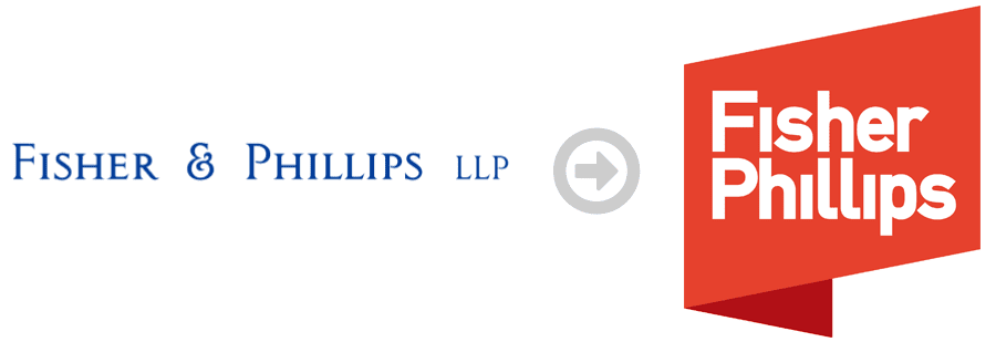
First we eliminated the ampersand. In the interviews, many of the lawyers had commented that it had become irrelevant; they’d already been calling the firm simply “Fisher Phillips,” which was nicely alliterative. We also changed the website URL from laborlawyers.com to fisherphillips.com.
We also wanted to radically redesign their logo, moving away from the conservative blue, serif font that failed to stand out. We went bold with a bright red, 3D effect, and large block of color, with the name in a strong sans serif (no “little feet” at the tips of the letters).
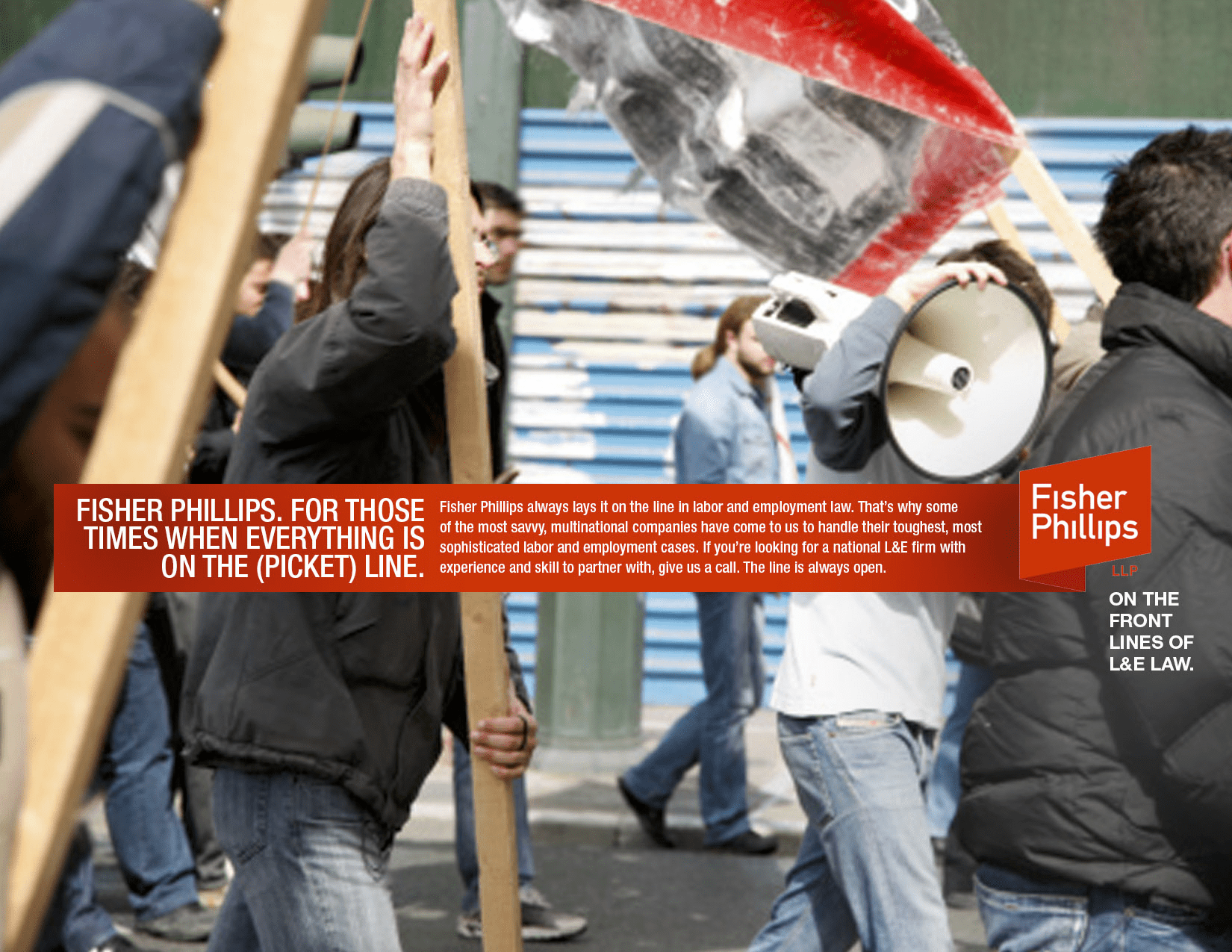
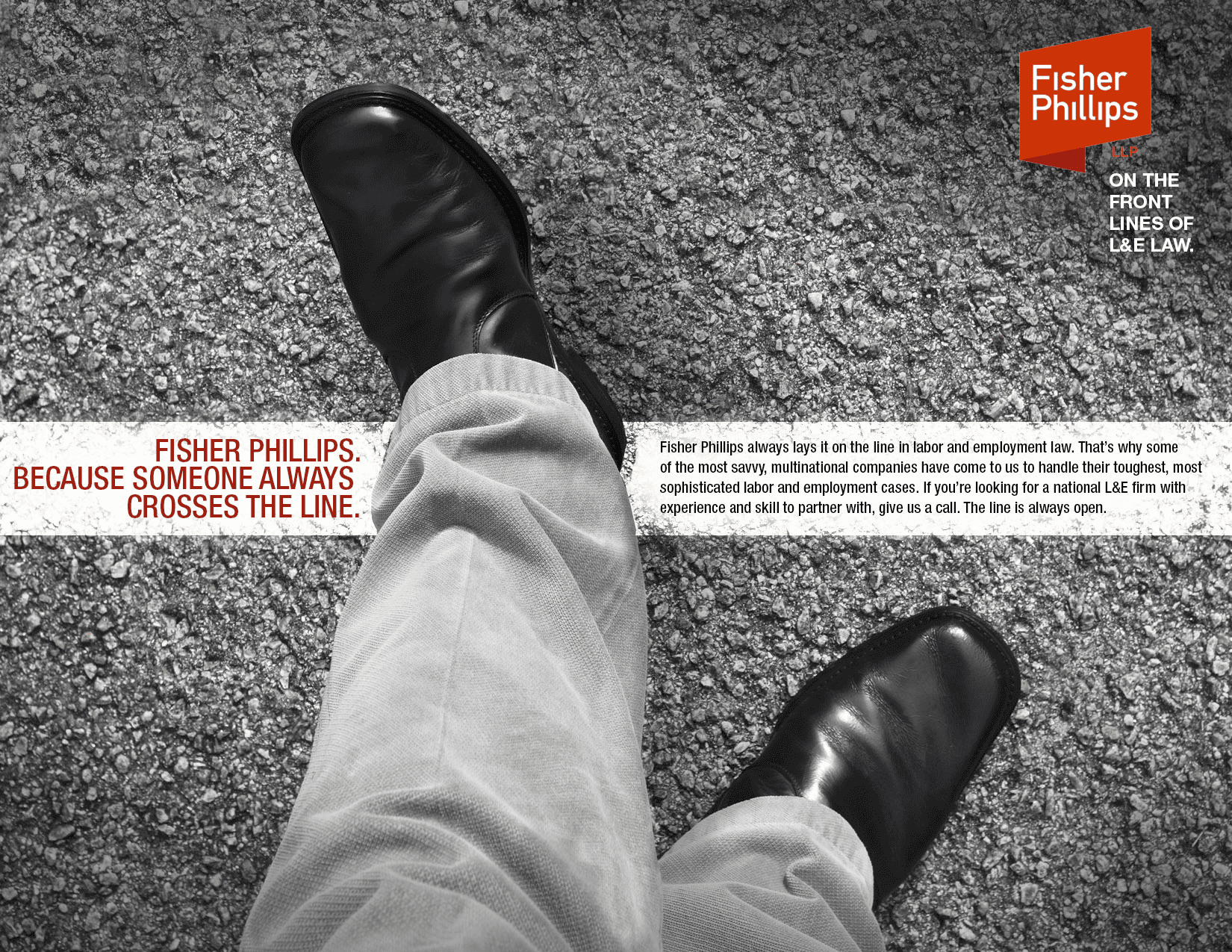
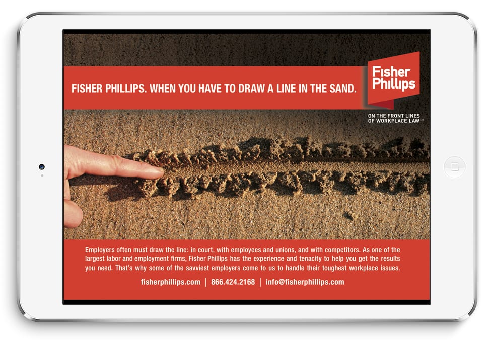
We offered a variety of branding designs and options, and the firm felt that the “On the Front Lines of Workplace Law” tag line best captured their high-end practice and personality, supported by a visual theme built around other “Line”-oriented idioms, like crossing the line, and drawing a line in the sand.
We also designed dozens of brochures and printed materials for the firm, and the Lines visuals formed the foundation of the new fisherphillips.com website. We launched a national print and online ad campaign in legal and HR publications, supported by their public relations efforts. The firm launched this initiative at a national retreat to much internal and client acclaim.