
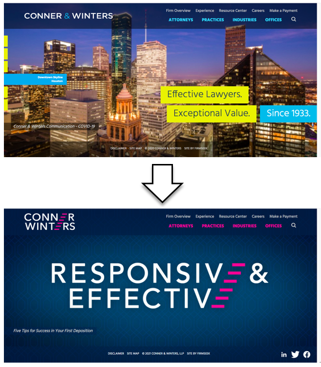
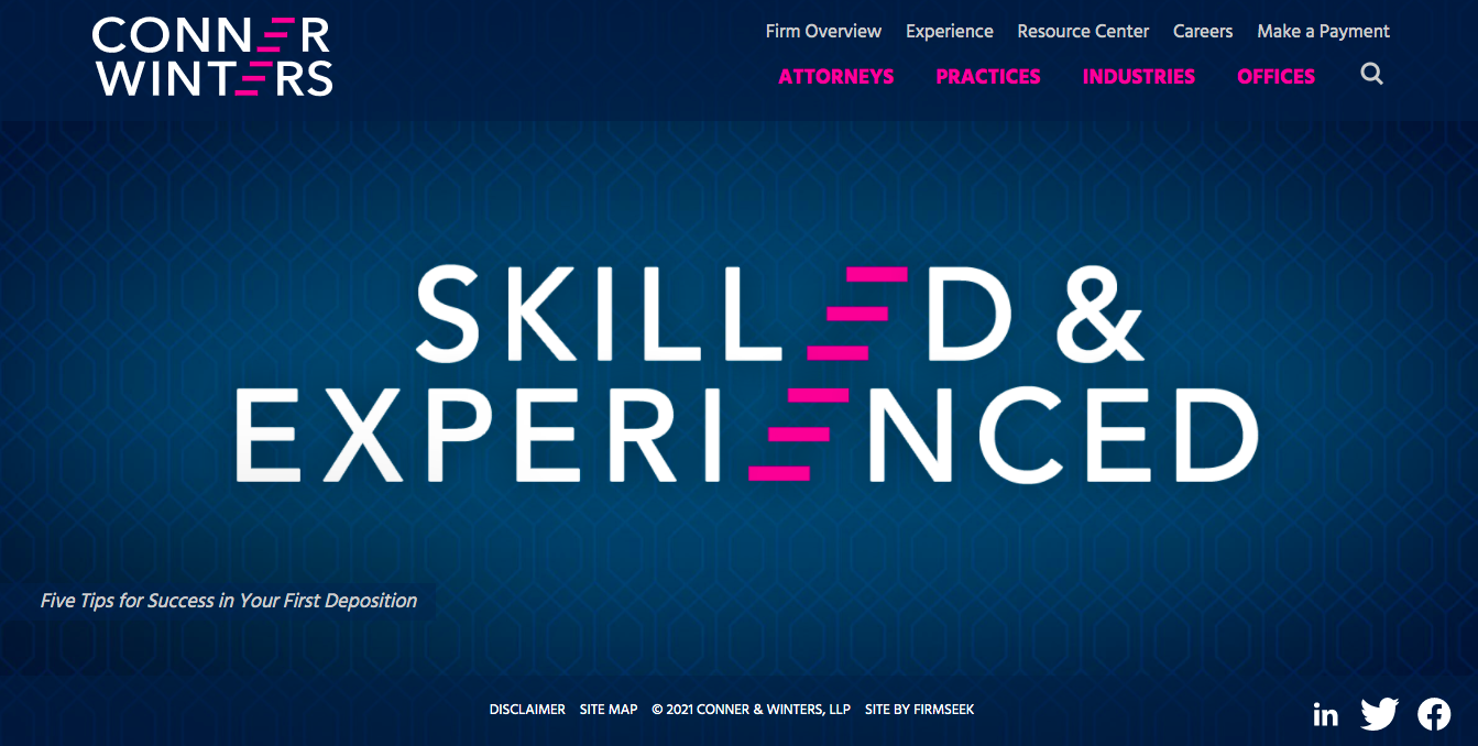
Tulsa-based Conner & Winters is Oklahoma’s leading law firm, with 100+ lawyers working from six offices across the SW region. The firm was excelling, but it was time to upgrade their website and create a strong new brand to showcase their market leadership. The home page deserved better than skylines and the logo was fine, but they deserved something bold, to convey their progressive and creative approach. They were ready to break free from their conservative reputation.
CASE STUDY
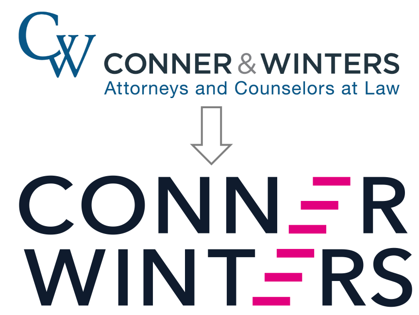
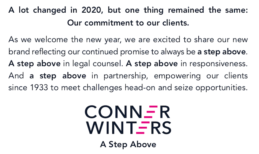
Logo
The logo uses a unique layout with stairstep Es, designed with four different unique and bold colors like magenta and lavender that look nothing like a traditional law firm. That set the stage.

Tagline
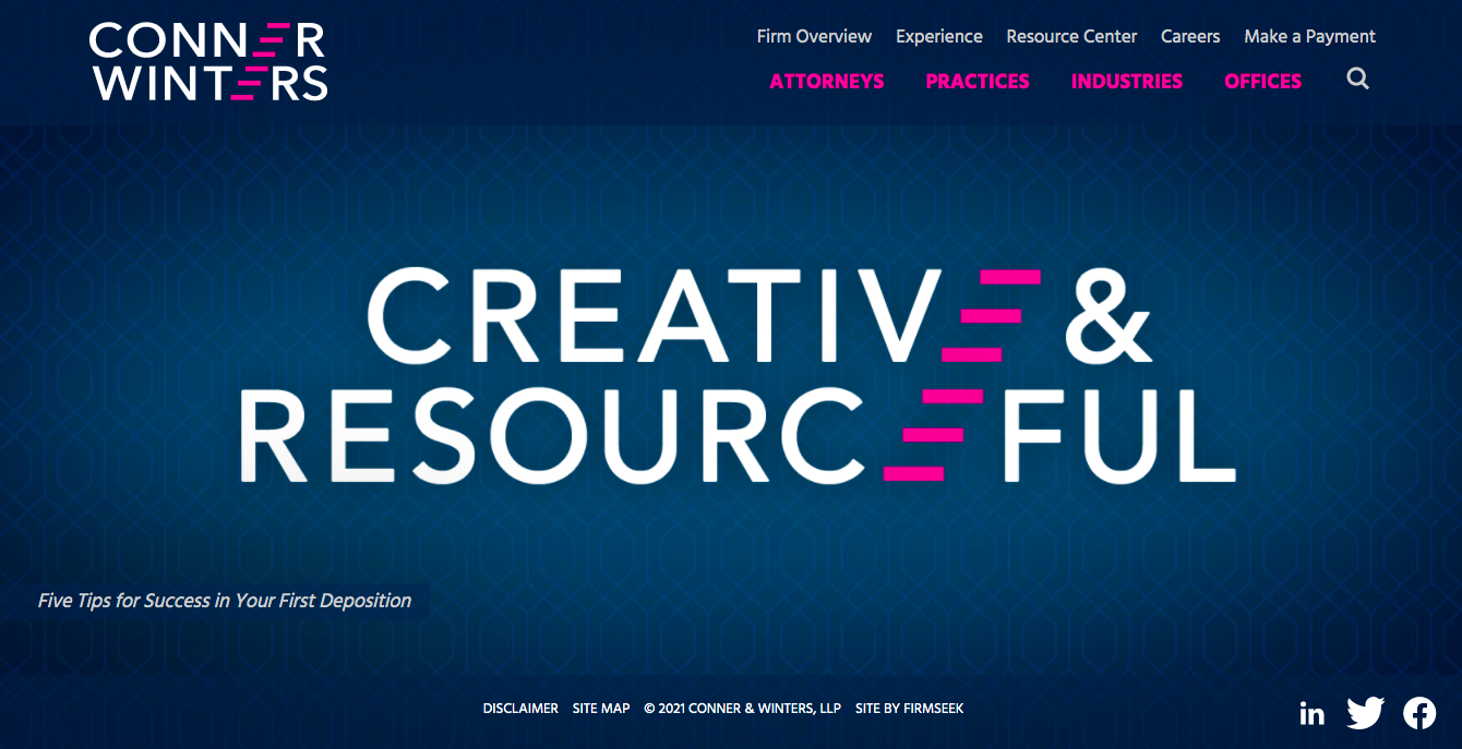
More than just top-tier lawyers, Conner Winters lawyers are renowned for their fierce dedication to responsiveness and client service, that they offer white-glove care to their clients. They offer more. The tag line summarizes this philosophy, while referencing the logo’s upward-moving stairstep design.
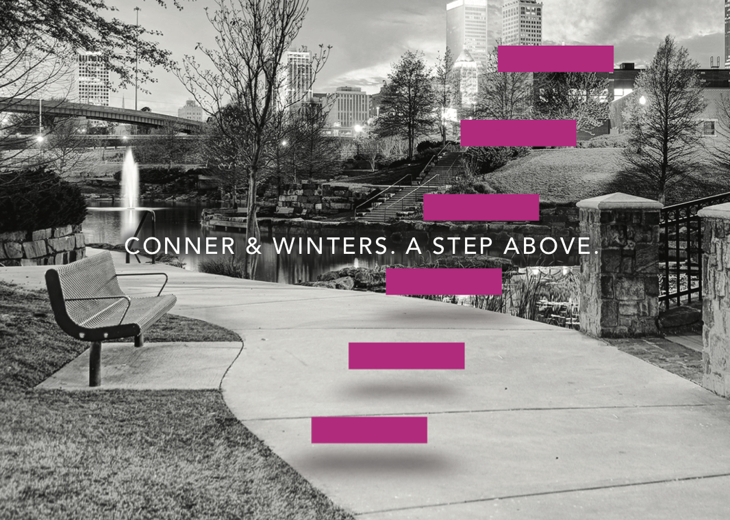
Conner Winters lawyers are “A Step Above.”
Launch
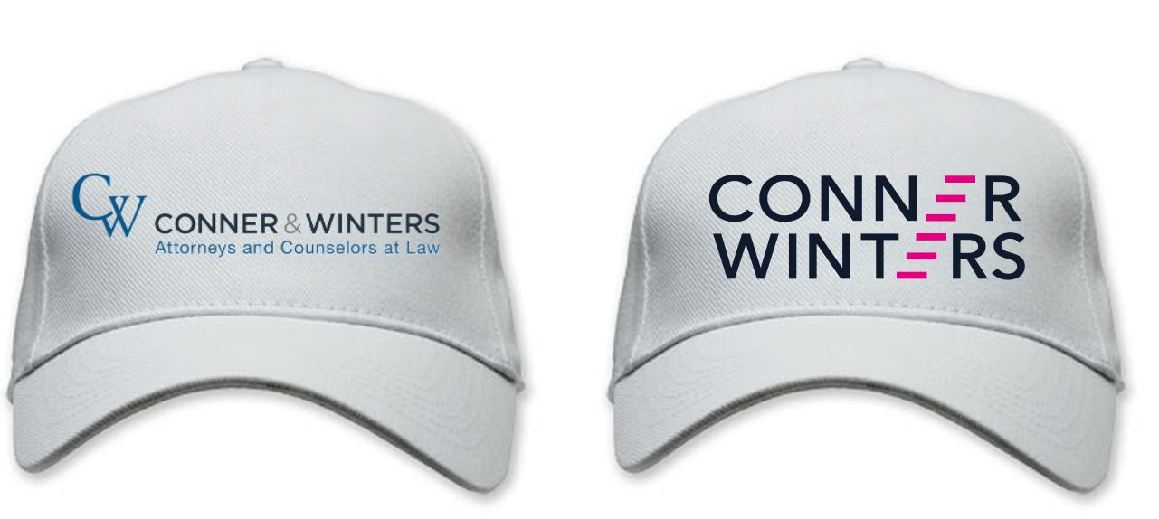
The launch materials included a black-and-white direct mailer with a pop of magenta, emphasizing the tagline.
INSIDE
