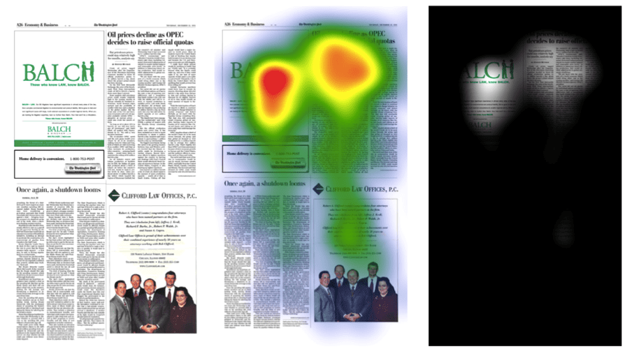
We developed many different Balch & Bingham advertising and marketing campaigns over a decade, rebranding the firm to emphasize the short and powerful first name, BALCH. In this industry-based series, simple one-color images leveraged both the firm’s name and the strong green color. Before launching, we conducted eye-track testing to ensure that even a simple ad like this could be visually powerful and grab the readers’ attention — even in comparison to the adjacent four-color ads.
We tested it directly against a typical “group of smiling people” ad — one example of the many stereotypic categories that we commonly see from law firms, to prove which grabbed the viewers’ attention. The heat map shows what attracted their attention and for how long.
Clearly, when done well, even a sparse one-color ad can draw significant interest and attention. Simple and inexpensive to run, it nonetheless met the clients’ objectives.


