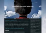
Vedder Price is a 250-lawyer Chicago-based national full-service law firm. As described in other case studies, we’d developed a series of campaigns to use on the London-based Global Transportation Finance website, which we narrowed to two finalists, which we entitled “Icons” and “Hats.”
The visually powerful and slightly humorous Hats campaign used a selection of England-centric images intended to convey that the GTF group was at the head of its profession: tops of heads of persons wearing a crown, a bowler hat, and a guardsman’s bearskin hat. Clever and particularly eye-catching, we knew it would work great as a print ad, where you need to break through the clutter and grab the disinterested readers’ limited attention. In print you’re in competition against every Nike or McDonald’s ad on an adjoining page.
But given the short timeframe involved, our immediate communication need was to convey the news by means of a website. Websites have very different visual needs than print ads. A website should be smart and visually interesting, to showcase your style and brand, but it need not be quite as vibrant as a magazine ad. They are viewed by volunteers, visitors who have proactively clicked to get your information. Your job is to make it worth their while once they’ve arrived.
The other finalist campaign juxtaposed two similarly shaped or conceptually analogous images from the US and London, connected visually by a plane flying overseas. The Brooklyn Bridge and London Bridge. The Statue of Liberty and Big Ben. The US Capital and Parliament. The simple headline behind the plane conveyed the message, variations on “Vedder Price. Global Aviation Finance expertise. Now in London.”
So we had developed two complete campaigns, including complementary home page designs. With an international audience, we knew it would be important to have a stand-alone website, which could be accessed worldwide, 24/7. And the GTF group’s messages were so different from the firm’s general messages, that it would be nearly impossible to reconcile the concepts and visuals.
Further, with a three-week development window, we did not have enough time to get firm-wide approvals and also make changes to the firm’s sizable website. We needed to be able to control the entire process on our own urgent timeline. We knew we could do this if we built the website on the powerful and flexible WordPress platform.
The website would be global, used by audiences from more-conservative cultures, where law firm marketing is not as aggressive. We knew that the Icon campaign, while less amusing, fit the Vedder Price culture better as well.
We felt the more conventional Icon campaign best suited our goals, but wanted to test both websites against each other to be sure. The easy part was securing the URL, which was available and also aided our search-engine optimization: GlobalTransportationFinance.com.
Comparing examples of the campaign designs, the “Hats” website design has a large photo that is more visually interesting, and slightly more humorous. The “Icons” website design also has a strong conceptually theme in the Hero/Banner section, but is more focused on the content. In our experience, both would work great, easily achieving the firm’s goals. But which one accomplishes those goals more effectively? Testing helped us find out.
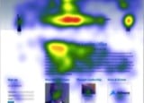
In our testing we were the first private law firm to ever use Eye-Track technology. Many consumer-product companies regularly use this innovative online research tool. The process involves surveying a selected test group of volunteers to review images online, while their visual responses to those images were videoed using webcams.
By tracking eye response and time spent on different parts of the page we could tell if the design was working, which meant if the illustration supported or detracted from our message. We could analyze what grabbed the viewers’ attention and in what order, as well as how long they lingered on various sections and elements down to the tenth of a second.![]()
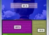
Test subjects were shown each home page for ten seconds. The results were revealing. For result number one, “Percentage Seen,” in the highly visual “Hats” design, the vibrant Beefeater hat is what the testers saw first, which held viewers’ attention for an average of 5.5 seconds before they get to the headline, which they read for 1.5 seconds. In the “Icons” version, they went straight to the critical headline.
Equally revealing were the test results we got when assessing average time spent on different parts of the two homepages. It was important that although 100% of the viewers saw the big black hat, only 81% noticed the headline below it. That indicates that if we selected the “Hats” version we should probably enlarge the headline, which raised design issues about hurting the visual esthetics. Contrast that with the overwhelming 96% who read the headline in the “Icons” design. While the Icons headlines weren’t wildly clever or amusing, they clearly and directly conveyed our message.
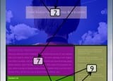
In both layouts the firm name is the third place viewers’ eyes go. In the “Icons” design, the important content headline, “Vedder Price’s New London Office” is the fourth visual point, and viewers spent 2.5 seconds reading it, then spent 4 seconds scanning the supporting News paragraph – another good result. In contrast, in the “Hats” layout, the actual information we want site visitors to remember is not noticed until the seventh Fixation Point. This layout takes a bit too long to get to the real information, and we risk losing the viewers before they learn what we want them to know.
When the viewers did get to that paragraph on the “Hats” design, they only spent a scant 2.5 seconds reading it. Contrast that to the “Icons” layout, where they stayed for 4 seconds — spending substantially more time reading that same paragraph.
This proved what we’ve long taught Fishman Marketing clients — “Conservative” does not have to mean “Boring.” In other words, a firm’s marketing can be professional, ethical, and conservative, while still being unique, eye-catching, and effective.