We represent 25-lawyer Hoogendoorn & Talbot, Chicago’s finest estate-planning law firm. A spin-off from Kirkland & Ellis, H&T lawyers receive much of their work from referrals from lawyers at other firms. They haven’t historically sought much visibility, and we knew they would benefit by building more of the type of name recognition that would lead to more referrals from the Chicago-area legal community. Their current website simply wasn’t doing them justice.
Redesign of logo
New marketing messaging
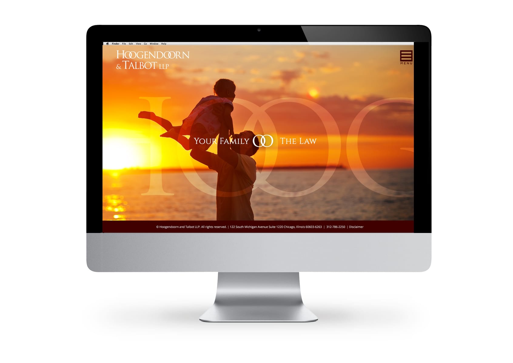
Clicking on arrow will reveal side bar with branding message and text.
WordPress Website Features
- Integrated Marketing Campaigns
- Responsive Design for Mobile/Tablets
- Fishman Marketing’s Legal Platform
- Animated Home Page Sliders
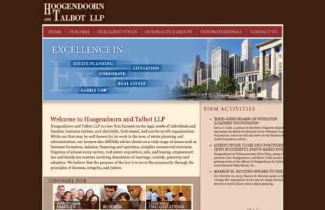
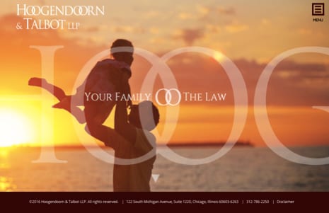
BEFORE AND AFTER
CASE STUDY
Hoogendoorn has many clients worth $2-10 million, but they often represent the ultra-wealthy families with $20 or $100 million or more, where The Family is the business — i.e. managing the money and assets, helping buy and sell the art collections, etc.
The Hoogendoorn firm had a challenging name (“HOE-gehn-dorn”), with two double-O’s, so we changed the logo to leverage that, overlapping the O’s into a Venn Diagram, then subtly using the Venn diagram design to show that they’re the positive combination of two things, e.g. “Family” and “Law.”