
Here’s EXACTLY what people look at on your website.
Which website design works better?
We’re using some pretty amazing technology to (1) help select the most effective campaign, (2) ensure that viewers focus on our message, and (3) optimize the design and layout. Check this out:

Here’s the story: These two home pages are intended to help the same firm convey the same message, they just use different visuals and layouts.
If your firm had to choose between the two designs below, which would you select? How would you know if you were making the right decision?
 |
| Two finalist campaigns. Both effective — which would work better? |
Does this help?
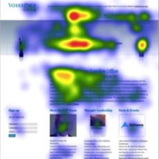
Now let’s take a closer look at that heat map. It shows what caught the viewers’ attention, where their gazes lingered, and for how long. It provides concrete data of whether your message is getting through. (Fishman Marketing is the only firm in the legal profession using this new eye-tracking technology to test ads, marketing campaigns, and websites.)
Here are the comparative Opacity Maps:

These are just the home page designs — a critical element in a comprehensive, multi-faceted marketing campaign designed to convey a message and achieve a specific goal. These two designs are simply visually different ways of conveying the same strategic message.What’s the intended message? Very simply: “Vedder Price opened a new London office supporting its Aviation Finance practice.” Vedder Price is a 250-attorney full-service Chicago-based law firm with offices in NY and DC. Within this firm is one of the world’s leading Transportation and Equipment Finance practices. Two prominent Aviation Finance partners (Gavin and Derek) and five associates, all from Magic Circle firms, would be joining Vedder Price and opening its new London office, particularly to support the Global Transportation Finance (GTF) group. (More info here.)
To convey this information quickly, efficiently, and cost-effectively, Vedder needed an integrated program, using a variety of traditional and online marketing tools.
We had just three weeks to develop and launch the entire campaign…
Working closely with Erin Veazey, the firm’s terrific Director of Business Development, we developed six different campaigns for their numerous target audiences. Consider, the practice has a complex interlaced variety of audiences — internal and external, client and prospect, US/UK/international, general and aviation industry. Each target requires different information and amounts of detail.
Therefore, we simply referenced the industry while creatively going the opposite direction — showing the contrail instead of the plane. In rail publications, we showed the tracks, not the train. Etc.
The Aviation Finance ad:

| Headline: “Leasing aircraft doesn’t have to be done on a wing and a prayer.” |
The Maritime Finance and Railcar Finance ads:

In launching new offices or practices, a firm’s existing website will often suffice, perhaps simply adding a new section or landing page to showcase the new information. Here the firm’s website would not work. It was too traditional and US-focused, and listed Aviation Finance as one of over 230 identified practice areas. They were updating the site, but it wouldn’t be done in time for this launch.
Although Vedder’s GTF practice was large and well known (led by Dean Gerber, one of the best lawyers in the business) they were competing against big-name global law firms typically ten times their size, e.g. Clifford Chance or Clyde & Co., which had dozens of international offices.
 |
| The Firm’s Existing Website |
This launch required a tailored Aviation- and London-focused approach. When you’re the smaller firm, you have more to prove; you must do all the little things well. And we could control the variables if we controlled the process and materials. This was critical because time was of the essence.
One campaign, “Hats,” was humorous and visually powerful, while still appropriate and professional. It was built off of stereotypic English “hats” like a British bowler, Beefeater hat, or Queen’s crown. We really liked this campaign; we knew its strong, unique look would cut through the clutter, quickly grab readers’ attention, and be easily remembered.Further, the airplane contrails in the background supported the visibility they’d previously earned with their existing GTF Aviation campaign (above). (The queen/crown one made us smile.) This campaign would clearly jump off the page as a magazine ad, but was it right for the group’s central website?


The other finalist, “Icons,” was clever but more traditional, using simple, similarly shaped, juxtaposed icons from both sides of The Pond, like the Brooklyn Bridge and London Bridge, or the Statue of Liberty and Big Ben. A plane icon visually connected them, highlighting the aviation industry, headline, and London-office message.


That is, when we test our advertising or marketing campaigns or websites, we want to see what actually works, not what people say works. I want data, not opinions.
So we conducted cutting-edge eye-track testing on both designs, to see what people were looking at. What grabbed their attention first? In what order did they look at the various design elements, and how long did they linger on each? Were they looking where we intended them to look? Participants can’t fudge this data. We’re offering this with ALL new Fishman Marketing marketing campaigns and websites. It’s incredibly powerful.

Then we can ask them individually a few follow-up questions about what they thought in terms of message and style – which was more professional or conveyed the sense of expertise? Did they feel, as we did, that one was more “Creative” while the other was more “Traditional”? Did either design have a particularly positive or negative effect on their perception of the firm’s Professionalism?
The research showed that the “Icons” campaign accomplished all of our goals directly.
The “Icons” campaign worked better visually for our more-conservative international audience, and actually helped the viewers focus on the parts of the site that we wanted them to see and recall. As much as we loved the “Hats” campaign for certain audiences inside the US, it wouldn’t work as the centerpiece of the global online strategy.


Below is the Fixation Order – showing what grabbed their attention first, second, and so on.
You can see that in the Icons design on the right, viewers read the all-important headline first.

All images (c) 2011 Vedder Price LLP or Fishman Marketing, Inc.
