
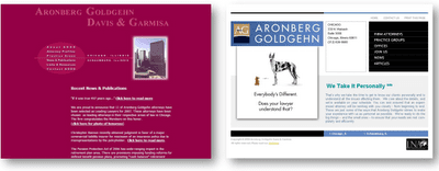
“We work in a city!” – Is that all you got?

Does your website home page still have a skyline?
Is that the best you can say about yourself and your law firm?  Is that what makes your firm unique?

The harsh truth is that you can’t prove that you’re a high-quality law firm if your website shows a skyline; it’s psychologically inconsistent.  It’s like walking into a doctor’s office and seeing a filthy lobby with ratty furniture — you’ll subconsciously start to question his/her technical skills.  You sense that a brilliant physician wouldn’t have shabby furniture.

And your home page is your 24/7 lobby-to-the-world.  It tells your story when you’re not around to do so.  It should set the tone and convey your style and culture.  What’s the nature of your practice?  What makes you different?  Why should a client hire you? What can they expect from your lawyers? How will they remember you later?

How many clients have ever said, “You know what I want from my law firm?  I want them to work in a CITY.”  It’s just not a decision-making issue.  

Try this:
Which of the two websites above looks like the more modern law firm?  (Click the image to enlarge.)  This is the before-and-after on one of our recent website overhauls.  Doesn’t the “after” version on the right look like a nicer place to work?  Don’t you think the lobby is cleaner? Isn’t their technology newer?  C’mon, admit it, you can’t help but feel that it is.
Jones Foster is a terrific firm, a leader in their market.  But their website had gotten older and needed a facelift; they needed an image makeover (more about that here) to help convey their quality.
Across the country and around the world, mediocre marketers and weak web developers, simply shrug and take the easy way out, and slap yet another building or skyline on another website.
Fight the slippery slide into ordinariness.  Demand more.

Again – which of these two websites looks like the higher-quality firm?  Aronberg Goldgehn is a small, creative firm where, we discovered the lawyers have a strong client-service philosophy — they really get “personal” with their clients.  Does their original website convey that sense to the viewers?  Of course not, it’s just a small skyline.  But the “We Take It Personally TM” we developed to help convey this message helps generate some interest and gives them the chance to tell their story.

Today there remain so many small-firm websites that look like the left side, the “before” home page.  Doesn’t the right side look more unique?

Figure out who you are and what you aspire to become.  Learn what your targets are looking for.  Get some outside help if you need it.  Then show that you provide those things, using all the marketing materials available to you, starting with your website.
I promise, if your home page has a skyline on it (or any of the other obvious law firm icons and clichés), your marketing is missing the mark.  You’re squandering an opportunity to be great.
And don’t you want to be great?
If you’re ready for something better, a website that works – if you’re ready to use marketing to help generate real revenue, call Ross directly at +1.847.432.3546 or ross@fishmanmarketing.com.