You ever receive a business card that’s on cheap paper?
One that feels thin and flimsy, and… wilts?
We all have. Remember the subtle, subconscious feeling of disappointment? What a missed opportunity that was for them to convey their quality and prestige? First impressions matter, and for a few lousy cents per card, perhaps an extra couple bucks a year, they could have conveyed a dynamic, high-end impression to every single person and prospect they met, all year.
Your logo and business card are the tangible, physical embodiment of your entire law practice. If your card implicitly says “Mediocre,” “Cheap,” or “Boring,” it’s just a little bit harder to prove that you’re high-quality and creative. Why take the chance? Would you trust your money to a bank that saved a few pennies on the paper on its executives’ cards? Would you hire a law firm to handle a crisis if their cards seemed to be designed by Kinko’s? Maybe. But maybe not.
Lawyers sell an expensive, high-risk, intangible service. Prospects can’t take us for a test drive, so always they’re looking for something tangible to hang their hat on.
This is why business cards are disproportionately important — it’s something prospects can actually see and feel. It’s why we usually recommend to our clients that we engrave their cards and use slightly thicker card stock. It’s why we make a big deal about a high-quality logo and layout.
Little things mean a lot when forming a first impression.
I spoke at the national conference of
The Federation of Defense & Corporate Counsel, a ~1,000-member honorary association of some of the nation’s best trial lawyers, in-house lawyers, and litigation managers.
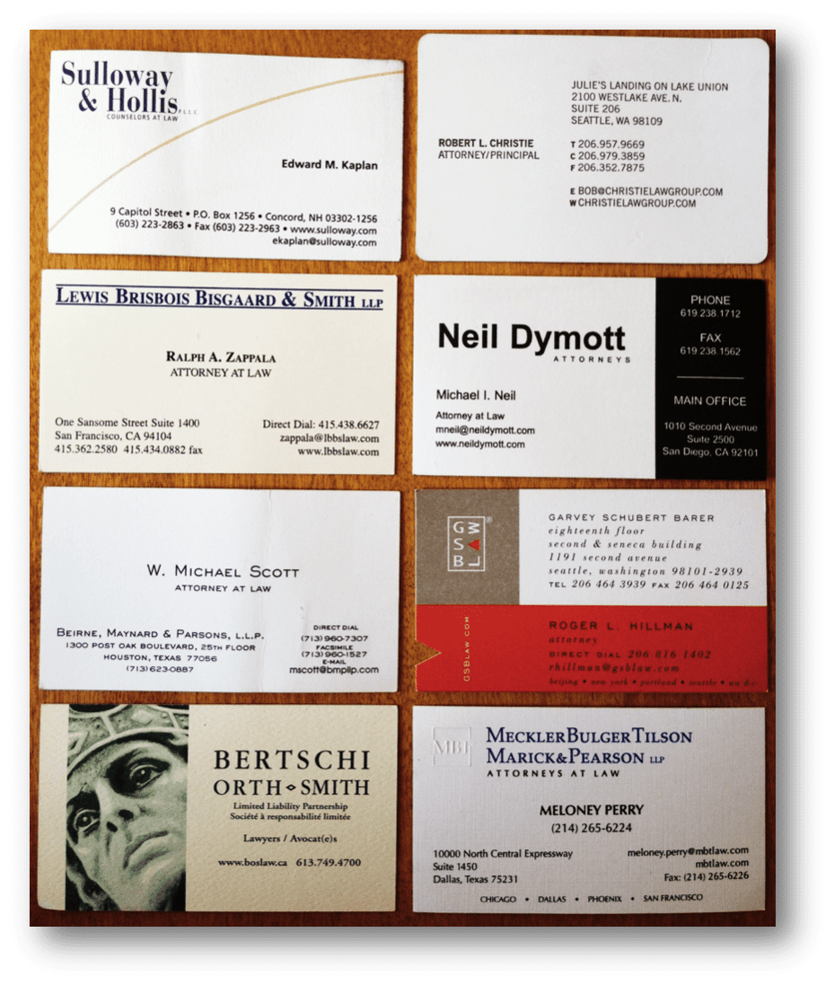
These are the types of lawyers who have handled hundreds of big trials. Of course, I collected some of the members’ business cards for later follow-up. And as always, there were the wide variations in design and message. Above is a quick snapshot of eight of them I just pulled out of my pocket. It’s a fairly typical cross section of what you’d generally expect to receive.
What card(s) grab your attention? Which do you like or dislike?
Most importantly, where does your card fit in this spectrum? These are all from high-quality trial lawyers, but the cards’ design, style, and tone vary greatly.
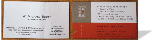
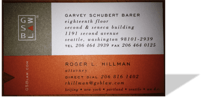
Garvey Schubert Barer’s strong orange box grabs your attention, and the unusual triangular notch adds interest. Compare the GSB card to
Beirne, Maynard & Parson’s to its left. These two designs convey very different messages about the nature of the firms’ culture, style, and practice. It’s not a question of whether any particular design is “better or worse” as much as whether the messages they convey about the firm are what they intend.
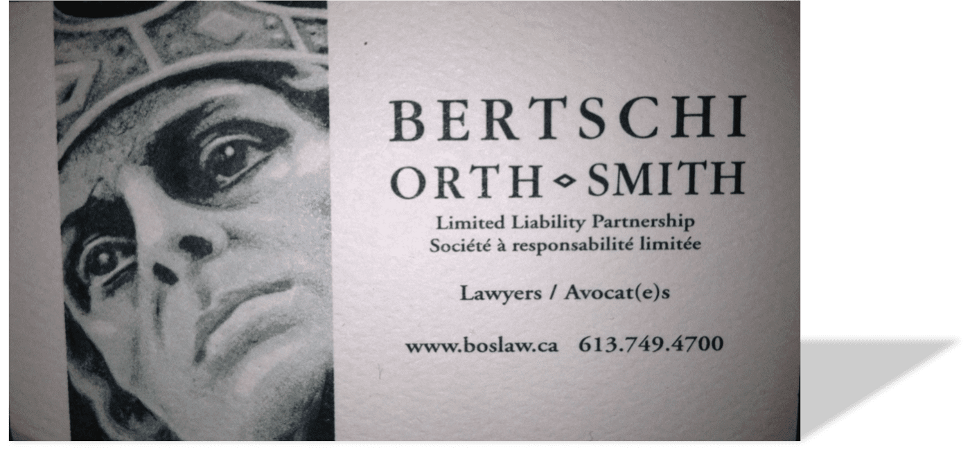
The piercing gaze of Ottawa’s Bertschi Orth Smith’s sculpture* commands attention.
Although you can’t feel it,
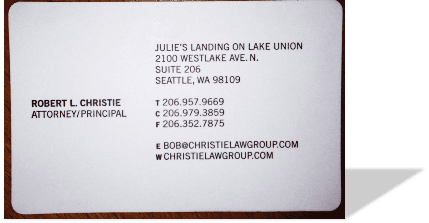
Bob Christie’s card in the top-right corner is both extra thick (practically a cardboard drink coaster) and a full quarter-inch taller than a standard card, and has rounded corners. The all-caps sans serif font completes a truly standout design – while elegant, this card could also come from a design, marketing, or other creative agency.
The Bertschi text is in all caps, emphasizes the first firm name, and adds an unusual diamond-shaped “ampersand.” Compare that to Meckler Bulger et al.’s, which weights all five names equally, with very little space dividing them. Note the subtly embossed initials.
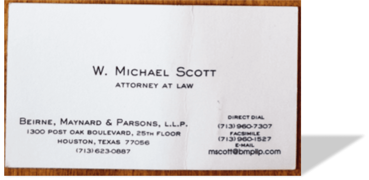
Do you see how the layout of W. Michael Scott’s card emphasizes the lawyer, rather than the firm?
Each is an intentional design decision made by a skilled law firm — either a specific choice made by a professional designer, or by the law firm’s simple choice to not use one. Look at these options, just a random group I pulled out of my pocket, and consider whether the card in your wallet conveys the message you want it to regarding the nature and quality of your practice.
For example, it’s easy for me to believe that
Bob Christie approaches his cases creatively – the clean design of his business card reinforces that message. Neil Dymott’s card is strong and direct — just like its dynamic founder, Marine
General Mike Neil.
Bertschi’s card makes me want to go visit the website for more information.
Does yours?
* “Whether to you our logo recalls Cicero, the Emperor Justinian I, Solomon or a Centurion – to us, it is a single figurehead upon which rests the foundation and principles of our practice.”
If your firm needs a better strategy, design, or marketing campaign, please give
Ross Fishman, CEO of
Fishman Marketing a call directly, at +1.847.432.3546, or ross@fishmanmarketing.com.
All the images (c) 2012 the referenced firms.
——————————–
Law Firm Speakers and Retreats is a Speakers Bureau designed for the legal profession. Offering 100 of the most-popular lawyer marketing training, law firm retreat, and CLE and Ethics programs and presentations — all thoroughly vetted. From Marketing, Social Media, and SEO presentations to the Future of the Legal Profession, you’ll find the best law firm retreat speakers.

![“Nice to meet you. Here’s my [crappy, flimsy] card.”](https://www.fishmanmarketing.com/wp-content/uploads/2012/03/fdccbusinesscards8.png)